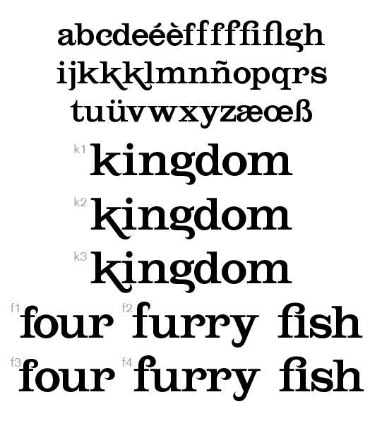
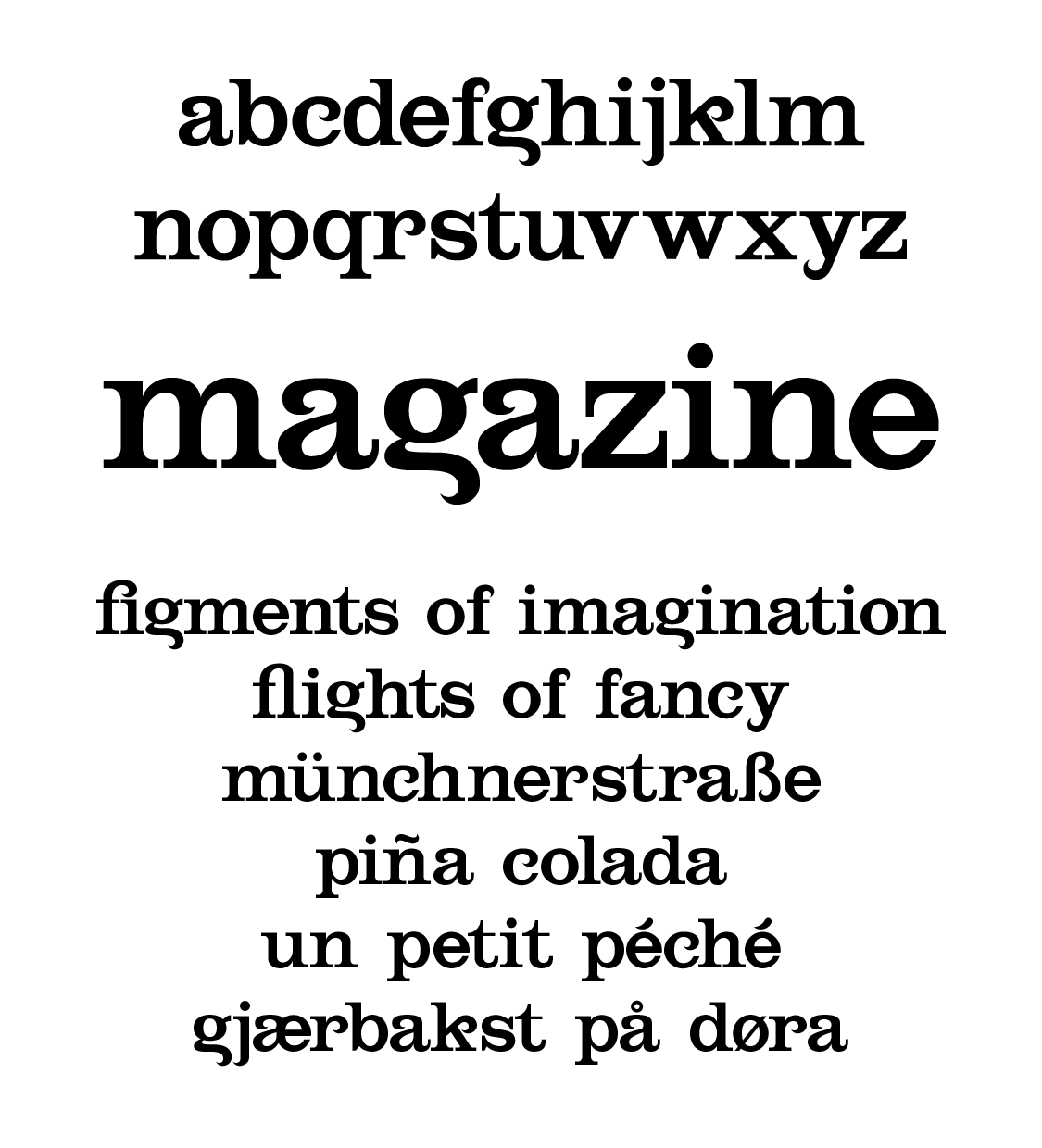
I was inspired by some samples from an old type specimen book (Edwardian era) to try adding some swash-like finials to otherwise basic serif letterforms. I chose to model the font after Clarendon, at least insofar as the contrasts and colour were concerned, keeping the stoic solidity of Besley's design while reducing the weight of the serifs to sit better with the more frivolous elements of my idea.
As I worked through some initial forms the font began to take on a life of its own, almost telling me what each letter needed to look like! ... and here is the preliminary result. Lowercase only for the time being. The r was my inspiration for most of the rest of the font, and I am particularly pleased with the way the g turned out.
As I am not a professional type designer, merely a hobbyist, I seek some initial feedback. I've been having some difficulty with some of the letterforms, notably the e and s, also the c, making them look good on their own but also fitting them with the rest of the font. There is a lot of work left to do, and spacing/kerning is only rough. I would like advice primarily on the letterforms themselves.
I don't have a good name for it yet.
| Attachment | Size |
|---|---|
| test1.png | 59.66 KB |