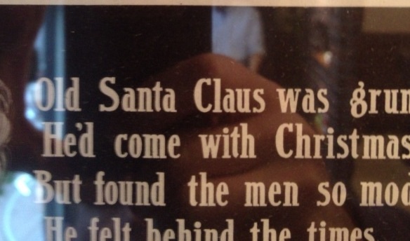
Dear All
Any leads on this font or any similar please.
Many thanks and apologies for the quality of the photo!
Best wishes
Steve
| Attachment | Size |
|---|---|
| image.jpg | 59.09 KB |
Dear All
Any leads on this font or any similar please.
Many thanks and apologies for the quality of the photo!
Best wishes
Steve
| Attachment | Size |
|---|---|
| image.jpg | 59.09 KB |

duplicate
don
I suspect the sign is lettering not a font as such. But I would be happy to learn of a matching font.
The lettering looks like something like _John Hancock_ -- Keystone Type Foundry, circa 1903, and condensed version by Lanston Monotype, circa 1917, digitized by Claude Pelletier http://www.dafont.com/john-hancock-cp.font -- meets early 20th century lettering for the _ g_. Here is one variation by Speedball with a bottom heavy _g_.


Also see previous thread http://typophile.com/node/106675 which includes discussion of bottom heavy _g_ in University Roman and Stunt Roman.
Don
Hi Don
Thank you so much for your input.
If memory serves, it was taken from an add for Williamsons(?) shaving soap, circa 1915 or so I would guess.
As the font is not entirely regular, I thought it may have been hand rendered but your leads for similar are very helpful. Apart from the 'g' it was the truncated 't' that grabbed me. :)
Hi Don
Thank you so much for your input.
If memory serves, it was taken from an add for Williamsons(?) shaving soap, circa 1915 or so I would guess.
As the font is not entirely regular, I thought it may have been hand rendered but your leads for similar are very helpful. Apart from the 'g' it was the truncated 't' that grabbed me. :)
Best wishes
Steve
Hi Steve. This was a golden age of lettering, with impressionist variations in letterforms. Check out the bottom heavy_g_ in these specimens designed cira 1915.


Also

Captured from commoncrawl.org on 19 Apr 2015. original URL