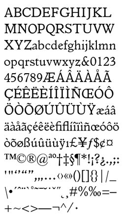
Hi guys, I would like to use this font for an important personal project.
It has got a good amount of glyphs, around 700. I like it because of its
roughness, but I’m not completely sure.
Could you guys express your opinion about it?
Have you any alternative for it?
Thank you,
Any doubts or strong opinion about it, will be well-accepted.