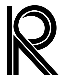
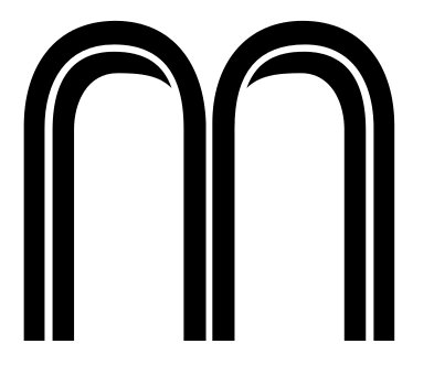
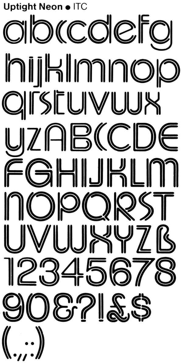
I am looking to identify the original name/designer of the font used in the uppermost catch-line of this advertisment from 1977 ("It's syn-ful!") ... and also in the company name seen on the cover of their 1977 catalogue.
A digital version of this face called "Upperville" was published by Bay Fonts in the early 90's, but this was an absolute travesty of digitzation, mostly likely an autotrace and with many forms different to the few printed samples I've seen. I am looking for more original printed samples, preferably the full set of glyphs, and the only way I will be able to do this is to know the original typface name. Knowing the designer/foundry will also help me to track down the copyright holder and to understand if that is still current.