Hello all,
I just started working on a new typeface. Working title is "Inky", not so very sure of that name in the first place. I was thinking about the ink splatters/clouds that Cephalopods eject. Some of the shapes used refer to a stylized version of ink blurps so to say.
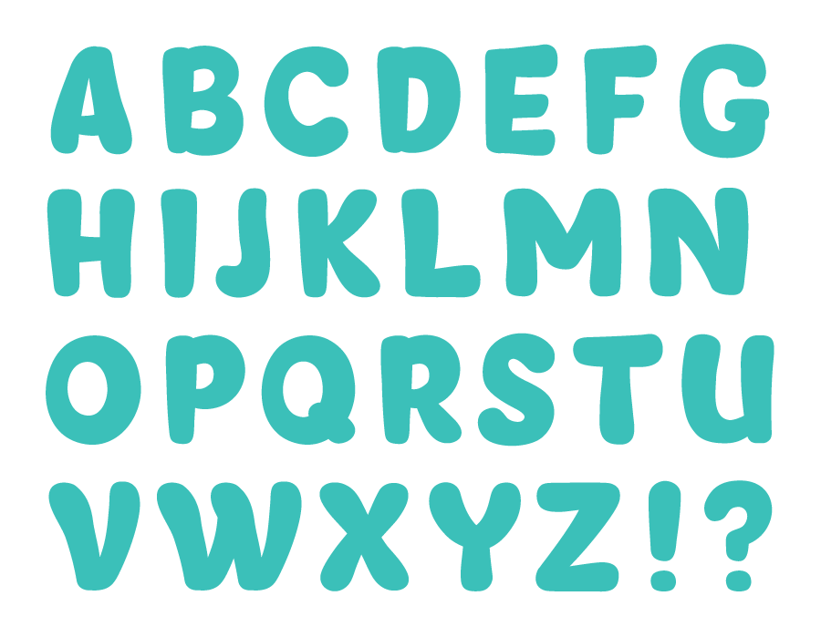
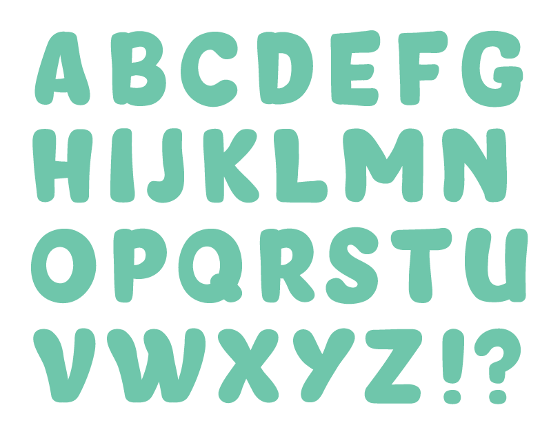
Anyway, I started with the capitals, see below. The C, G and U might still need a bit of work (or a complete rework maybe). The M and N are quite wide compared to the other letters but I'm unsure right now how to solve that. Quite pleased with how the V and W turned out - although on some points these might stand out a bit.
Comments and suggestions most welcome!