
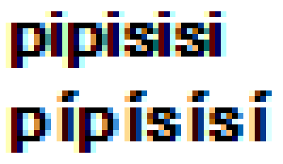
I'm total noob when it comes to fonts but my eyes hurt every time I look on MS Sans Serif. My issue is with spacing/kerning before "lower case i with acute" letter - there's just too much space. See attached sample (MS Sans Serif, 8 px). Is something like that normal/tolerable or is this a bug?
| Attachment | Size |
|---|---|
| pipisisi-ms-sans-serif.png | 2.13 KB |
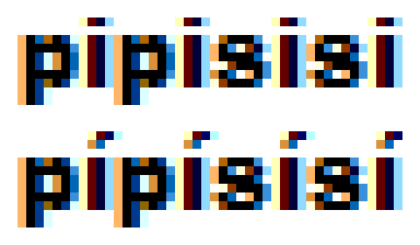
| pipisisi-arial-black.png | 2.11 KB |

ok