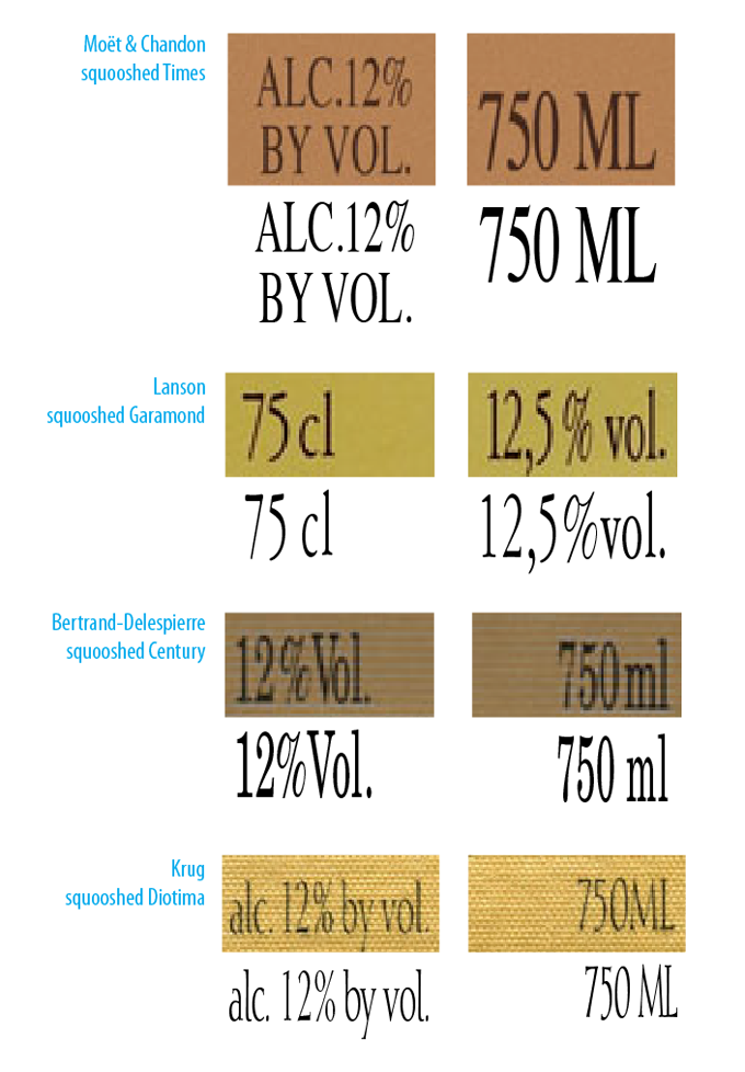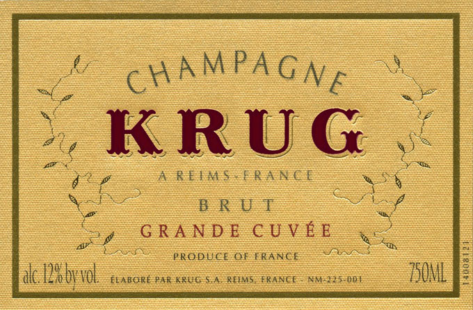
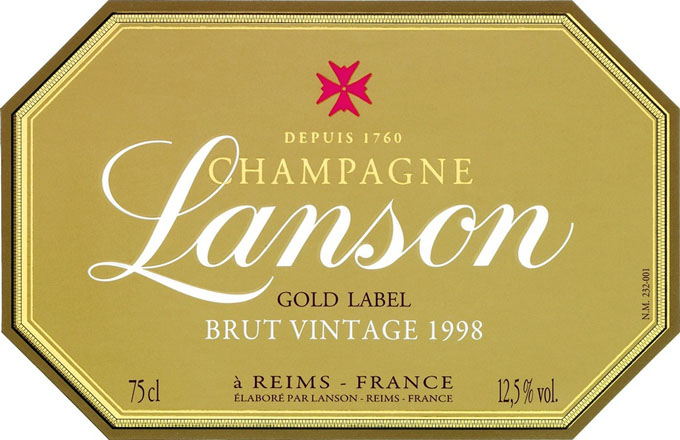
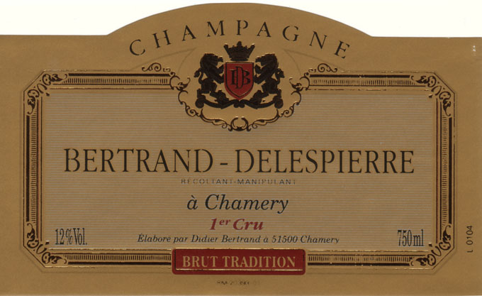
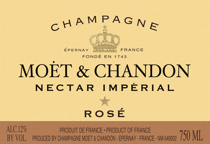
Hello Typophile
If any of you knowledgable folk can identify the typefaces used for the alcohol percentage and volume on the wine labels uploaded in this post I would be awfully grateful. I particularly love the one used on the Krug label, as it has the lightest footprint. Any suggestions for compressed romans with a more charigraphic nature rather than transitional/modern which would be suitable for the alcohol percentage and volume would be greatly appreciated.
Robert
Font:
Times, Garamond 3, New Century Schoolbook, Diotima
Solved By:
| Attachment | Size |
|---|---|
| krug_680.jpg | 147.64 KB |
| lanson_680.jpg | 91.8 KB |
| Bertand-Delespierre_BrutTrad_680.jpg | 84.16 KB |
| champagne_moet_rose-680.jpg | 86.61 KB |
| Screen-Shot-2013-10-18_680.png | 272.52 KB |