It's my first post, so hello everyone.
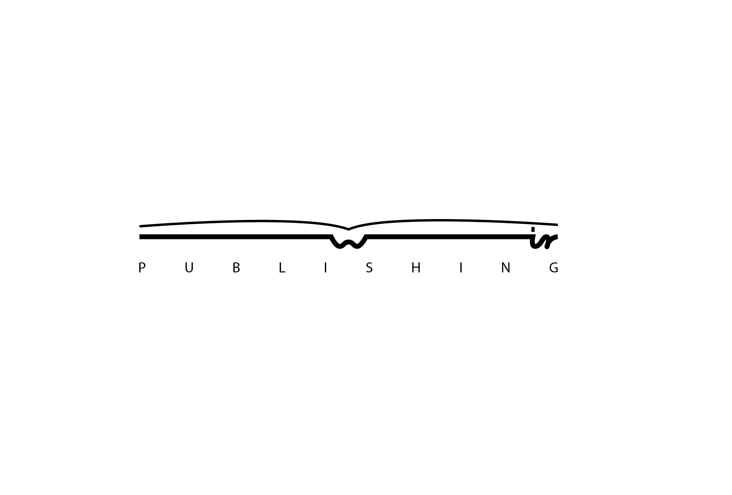
I would like to know your opinion about this logo, which I created for publishing company called WiR. It's completely imaginary company which produces books and e-books in two languages. My idea is that they have a special method where text flow from one language to the other. That's why I tried to connect all 3 letters. "W" and "R" are first letters of founders surnames and "i" is "and" in my language. What do you think?
[logoWir.png]
| Attachment | Size |
|---|---|
| logoWir.png | 30.94 KB |