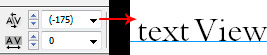
"Bembo Std family is designed to be used at a text size of 8.0 points"
Metal fonts could and often did have different designs for the different sizes. When fonts were first made available as photocomp, traditionally, an 8-point master (for footnotes) was made, a 12-point master (for text), and finally, an 18-point (for display). "Master" equals the size of the design with the metal fonts.
Generally, these were "somewhat" successful. The people making up the photocomp fonts usually didn't have the skill, or maybe time, to get the thick-thin proportions of the metal fonts, when printed with the paper of the time, into the photocomp environment. As a result, one size was often more successful than the others, and occasionally, the 8-point "master" became the preferred version. It could be more than just the technical success of the rendering, of course, Magazines were coming along, and the design of a "footnote" font more closely matched the perceived needs of magazines than text fonts.
For all these reasons, the 8-point master became the preferred one for Bembo in photocomp, and the only one originally offered in PostScript (for Bembo "Standard"). You don't think they redid anything, do you? Not for PostScript, and not for OpenType.
However, it is still terrible. If you want to use Bembo for text, you should be using the newer Bembo Book. Why do they still sell the Standard? Well, a fool and his money are soon parted; if you'll buy it, better they get your money than someone else, eh? And the "Standard" is still marginally useful for display settings, even though it is an 8-point design.
Nice font in metal. Rushed to market in Photocomp (and PostScript). Happened to a lot of the fonts popular in the metal era. Your money, your choice.
As to the kerning. Yes. A part of setting type. That's what typesetters are for. You need to learn how to do that. We're still not to the point where you can simply dump a text into a machine and wonderful stuff pops out. Probably never will be, unless we standardizes everything -- type size, measure, margins, on & on. Most of what a typesetter does is to try & pick the best compromise.
Kerning isn't a compromise? It falls between letter pairs, with no eye to the letters on the other side of that pair. Example: Kern WAVE by hand. For drama, use a setting size of 18 points. Now use the same value for WA that you used in WAVE, but set WARE. In 14-point. As Alan Greenspan was heard to say, "oops!"