
Hello,
I'am working on a logo for my studio that develops interactive books and games. I am quite happy with the logo, but I really need help with tweaking the letterforms - optical corrections with "mber" letters mainly (I am not experienced enough with it). Will be glad to get your help, thanks a lot.
| Attachment | Size |
|---|---|
| logo.jpg | 35.58 KB |

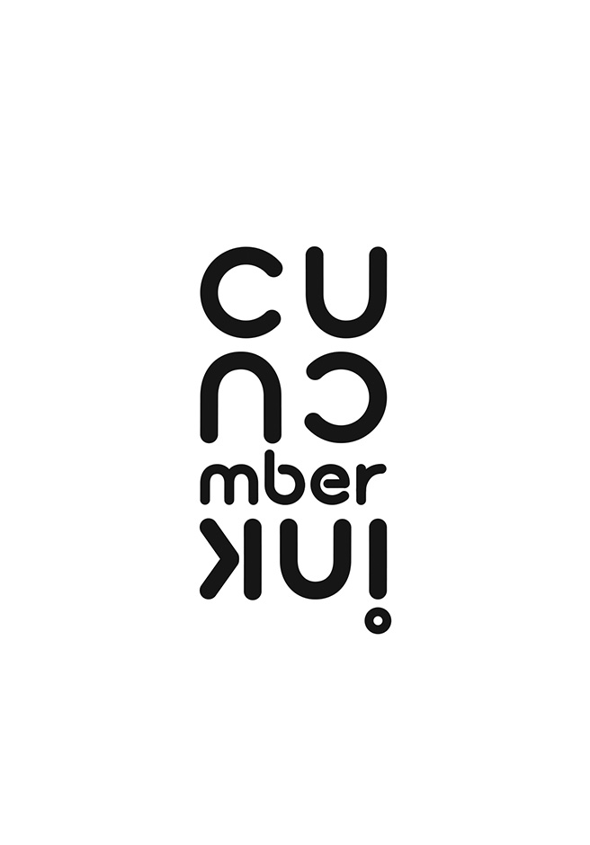
Is it supposed to be "Cucumber UK!" ? It's a bit difficult to understand/read...