
Hello type geniuses!
Any idea what this display font is? Perhaps there is a font similar?
| Attachment | Size |
|---|---|
| Flash For Freedom.jpg | 38.4 KB |
Hello type geniuses!
Any idea what this display font is? Perhaps there is a font similar?
| Attachment | Size |
|---|---|
| Flash For Freedom.jpg | 38.4 KB |

duplicate
Don
Signet, New York, 1973 lettering probably from Photolettering but I don't know the name off hand. [BTW the sexist cover illustration is by Frank Frazetta.]
F and underscore are probably custom artwork.
Sansita One by Pablo Cosgaya at Omnibus-Type could be edited to produce the lettering:
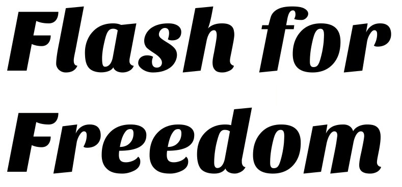

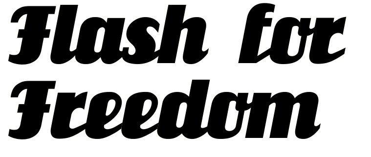
It has much in common with a manually slanted Salut.
Interesting. Here is Salut, slanted 11 degrees, to match Sansita.
You guys are awesome. I could picture Salut in my mind, I knew I had seen it but I didn't know the name. I'll try it a try but please let me know if you think of something else.
Nick Curtis did a version of Salut using the name Unicorn.
Don
Interestingly, Nick's naming of Unicorn was surely derived from Alan Meeks' reworking of Salut - which he called Einhorn. I wonder why, when Unicorn is clearly based on Salut rather than Einhorn.
Thanks Mike for the followup. I love trying to set straight the provenance of interesting fonts.
Don
As do I, Don. You clearly have lots more resources than I, though - so I read most everything you write on this forum with interest.
I supplement web resources with a few printed books. Wish I had more.
Don
The uppercase letters in Einhorn are less cartoony than Salut.
I prefer Einhorn a lot more.
Captured from web.archive.org on 31 Aug 2014. view this capture
