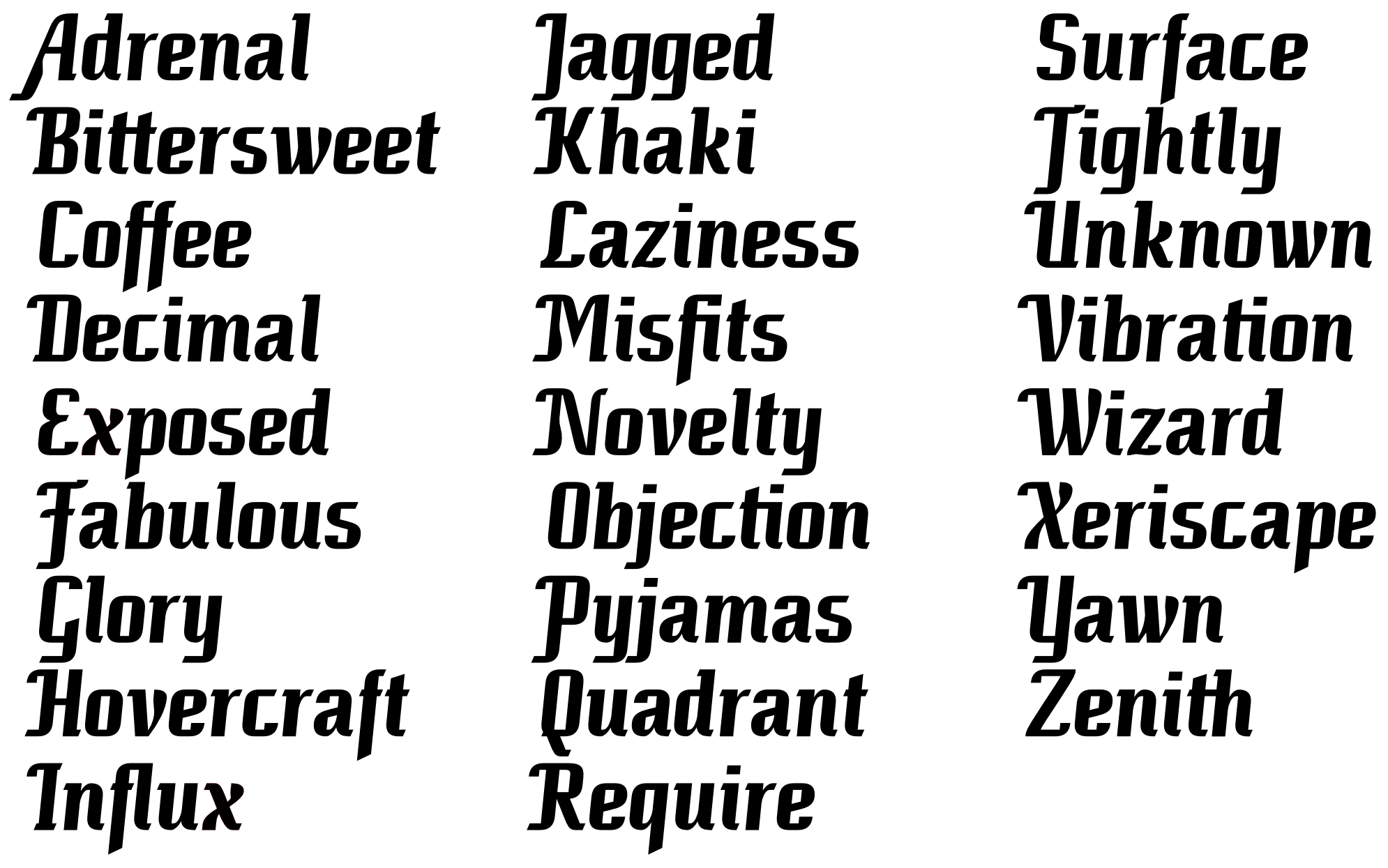
I’ve been working for a few days on my very first typeface. I’m trying to emulate a calligraphic style while staying true to a rather coarse grid. Please review it and tell me what you think about it.
| Attachment | Size |
|---|---|
| ashfont2.png | 207.85 KB |
I’ve been working for a few days on my very first typeface. I’m trying to emulate a calligraphic style while staying true to a rather coarse grid. Please review it and tell me what you think about it.
| Attachment | Size |
|---|---|
| ashfont2.png | 207.85 KB |

interesting! reminds me a bit of emigre
The A and M/N strike me as a bit off with the stroke modulation. I can see the logic on the N/M though
Actually the idea for the A came first, and the rest of the font was built around it.

I like it quite well, it's original and has a certain drive.
I agree with Michael's comments, though. That {A} doesn't quite work for me. Also, the bottom of the {a} looks pinched and somewhat out of place among the other letters. The crossbar of {F} is a bit timid.
Cheers
I would consider making the 'Z' a bit heavier also. looking forward to seeing more of this
***edit - when I say heavier what I really mean is less whitespace
The descending T is confusing and likely to be taken for a J as often as not. Probably should just truncate it at the baseline.
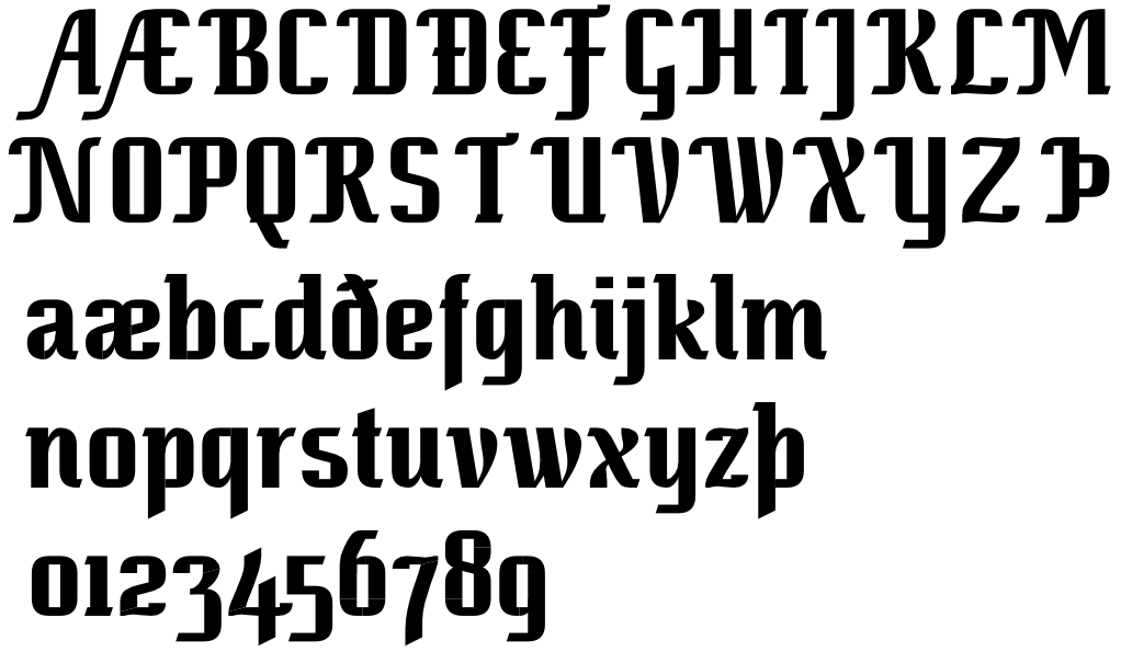
I was continuing the development of this font, but I lost the SVG file on which I had laid out its elements. I tried to match the original as best as I could, with some stylistic changes here and there. As for major changes, A M N no longer have stroke modulation, P T Þ now end at the baseline, and the diagonals on K X k v w x are now uniform.
Captured from web.archive.org on 17 Mar 2015. view this capture