
Flopping the A here makes a lot of sense, avoiding the unsightly concentration of two heavy stems in close proximity.
I’m thinking of implementing this feature in an upcoming type design.
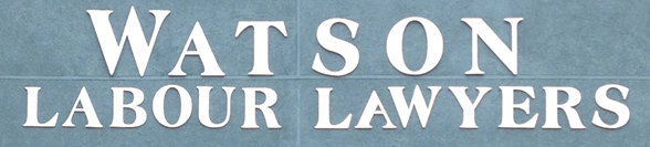
Flopping the A here makes a lot of sense, avoiding the unsightly concentration of two heavy stems in close proximity.
I’m thinking of implementing this feature in an upcoming type design.

Hmm. They could have flopped the A in Watson as well as the one in lawyers. However, I find it distracting, and I believe most people will not accept such an innovation.

Flopping the A … didn’t you know that this is sometimes even considered as a highly subversive act? ;–)
Flopping the A … didn’t you know that this is sometimes even considered as a highly subversive act?

Hehe.
I’d love to see how this turns out, Nick. I am — occasionally — a big fan of yours. Keep up the good work!
Not sensing a lot of support for this idea—which I always find encouraging (for retail products that is, not so much for commissioned work).
There’s potential here, for other letters of the alphabet too:


Very interesting, There is potential for letters like: A, U, V, W, Y, M...
I made quickly one experimental sample:

p.s.
what's wrong with "Insert image" on typophile.com? I have always "Could not copy image. Error".
Such an effect would be supported by the failure of the feature when tracking is changed.
i.e. it would only occur when the letters are close, not when letterspaced, where it is not necessary.

If tightly set, "COUNTRY" could benefit from a flipped |N| too, in order to avoid clashing serifs.
Captured from web.archive.org on 5 Feb 2015. view this capture