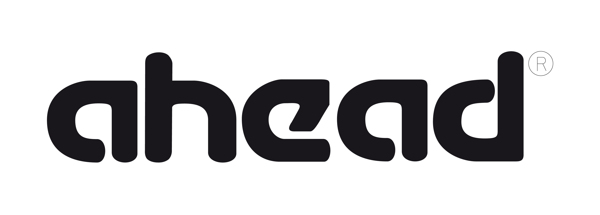
I think that it's 'Mottek', but it's not rounded like the attached logo.
Am I right, or there another variant?
Thx in advance.

The font that Mottek and Cupertino (dafont.com) were based on is detailed here: http://en.wikipedia.org/wiki/Typography_of_Apple_Inc.
The Apple logo characters are the same general width as the characters in your sample logo, so I would say that someone has either used the Apple logo characters as a guide and drawn the logo by hand or they used one of the two free fonts (both of which are a lot wider) and created the logo that way, making the corners and some parts round in the process.
Of the two free fonts, Mottek is the better quality one.
Thank you very much George.
It's so helpful for me.
Much appreciated ;)
Captured from web.archive.org on 15 Apr 2015. view this capture