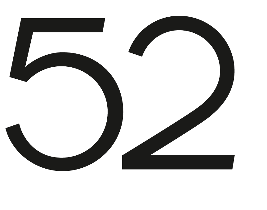
This is the early sketch of a logo were i'm trying to design the typography myself.
I'm happy with the '5' but i wonder if the '2' is of the same looks… what do you think ?
| Attachment | Size |
|---|---|
| 52.png | 30.9 KB |
This is the early sketch of a logo were i'm trying to design the typography myself.
I'm happy with the '5' but i wonder if the '2' is of the same looks… what do you think ?
| Attachment | Size |
|---|---|
| 52.png | 30.9 KB |

In terms of balance, the 5 is bottom-heavy and the 2 is top-heavy; so, IMHO, I think they work well together, and also make for a distinctive logotype.
Captured from web.archive.org on 19 Apr 2015. view this capture