Hello,
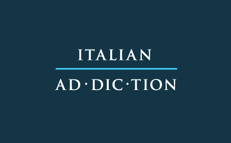
I am currently working on a logo design for an italian food blog that has to communicate a sense of professionalism and elegance .
After a series of drafts this is what I ended up with. The typefaces I used are a classical italian Bembo and a more sleek and modern Avenir for the more serious text "Addiction". I am in a position where I think I can kind of see the potential in the idea, but something is still off, something needs to be improved in order to make the logo shine.
I need some third eye points of view from the persons of the community, so any feedback/comments about it will be highly appreciated.
Thanks for the attention
| Attachment | Size |
|---|---|
| Test 1.jpg | 120.33 KB |