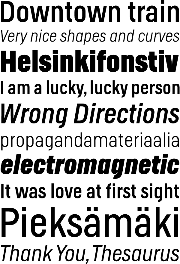
I have currently updated my Helsinki typeface, expanded the character set, and also added italics. Helsinki is inspired by the Finnish traffic sign typeface. It is based on geometric shapes and quite narrow, which makes it well suited to headlines and short texts.
Now Helsinki Webfonts are also available. I made this little demo page, to show the fonts in action: http://helsinki.ludwigtype.de
Enjoy, Ludwig