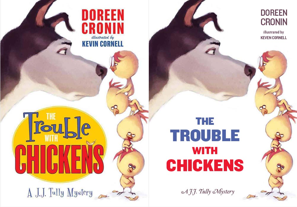
Clean, legible typography. That's what I always learned and I still believe it to this day. I've started to look at children's books, specifically very young children (2 - 7), and the kind of typography used in them. I'm coming to the conclusion that most children's book authors don't ever consult with a designer or typographer.
I'm aware that you're dealing with an immature audience but is that an excuse to use illegible type? I think not. Perhaps I'm missing something. One of the reason I'm here is to find out if I am.
I decided to embark on a very quick redesign of the cover of "The Trouble With Chickens" as an experiment. I used H&FJ Knockout.
The cover on the left is the original. Take a look at the word 'Trouble". Why is it written like it's having a seizure? Do you think that is supposed to be representative of the action behind the word? I admit that if you're having a seizure you're in trouble, but that's still no excuse for illegible typography.
My redesign certainly isn't production-ready but it tries to communicate that simplicity is more legible the stylized "Children's type".
What are your opinions?