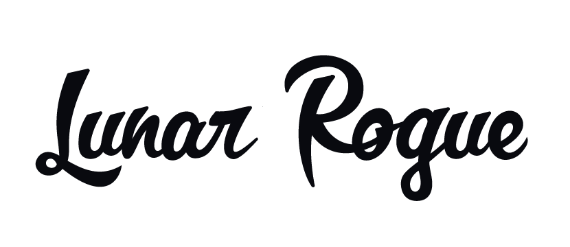
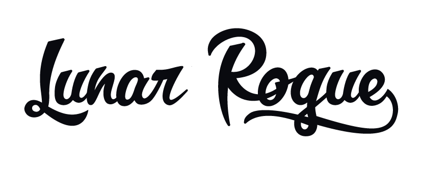
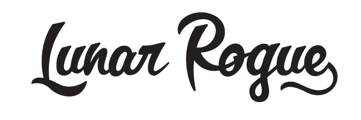
This is somewhat of a pleasure personal friend project, so I thought it would be a good time to challenge myself to create my first custom script. Having made it to this point and facing a bit of a deadline, now I'm aching for some critique from those more experienced than myself.
I love how the "R" and "o" interact and I've been trying to base the rest of the script around those shapes. Overall, I'm really liking the direction here, but there are some areas that are really giving my headaches- The "L", lowercase "r", "e", and just some of the weights and curves in general. I've also been trying to incorporate some kind of underline element like what is below, but I'm not sure how to carry that through and balance it out on the "Lunar" side.
Any thoughts and advice are super appreciated! I know that there are some glaring areas here, but feel free to nitpick on the details if you so choose.
Thanks!!!!!!!!!!!!!