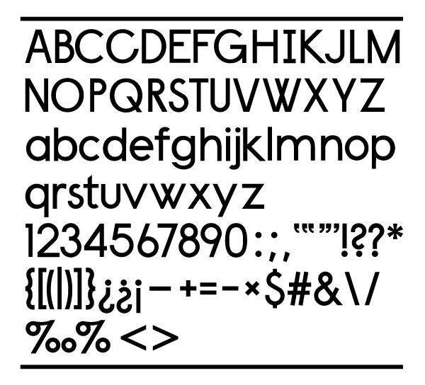
This is my first attempt at a sans-serif font with a bit more complexity than your typical strict geometric sans...
I wanted something that melded together Century Bold, Futura Medium, and your typical bold/medium grotesk, something like Helvetica Bold. I wanted the geometry to be something a bit "dumbed" down rather than strictly machined, but retain a sense of craftsmanship.
As I said this is my first attempt at something other than a geometric sans, and was drawn in illustrator(haven't quite been able to figure out fontlab's drawing system...) and want to try and iron out as much as possible before I begin to import the characters.
Please any suggestions at all are welcome.
Thanks,
David
| Attachment | Size |
|---|---|
| font text1.pdf | 364.01 KB |