
Hi Everyone,
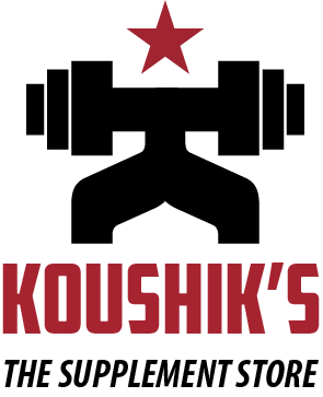
I need some feedback on this logo.Client business is to supply food supplements to gyms. Here is the logo.
Thanks in advance.
Hi Everyone,
I need some feedback on this logo.Client business is to supply food supplements to gyms. Here is the logo.
Thanks in advance.

Feels very Russian Constructivist.
Agree with aluminum, especially with the name Koushik's and the red star it has a Russian feel.

Like Darrel, I get a Soviet-era propaganda feeling from this (the red star triggers that response in Americans old enough to remember the cold war).
The figure doesn't say "healthy athlete" to me; it looks more like a very strong robot. Overall, it's extremely macho, as if the client assumes that their product(s) will not appeal to women (which may be true, in which case macho is the way to go).

Take a look at dropping the "S and the THE (which is a great band btw) from the tag line.
After centering KOUSHIK and SUPPLEMENT STORE (which doesn't really need to in italics) you might find that the logo is a stronger mark with more weight to it.
Captured from web.archive.org on 4 Aug 2014. view this capture