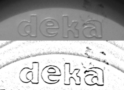
Looking for this fonts used to create this logo.
It looks like a combination of two different fonts but I'm not sure it may just be the weight of the characters themselves that make it look like it's two different fonts.
Also some of the terminals seem to have a slight serif almost like a Cooper black terminal only not so extreme.

| Attachment | Size |
|---|---|
| DekaLogo.jpg | 67.72 KB |