
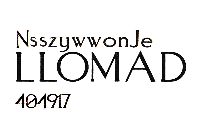
Trying to figure this font out. Saw it on a business card...the S and W have an interesting uniqueness to them..while the Y tapers off into a fine point. The font seems so close to optima but it just isn't because of the afore-mentioned features. What could it be?
Font:
Aquaduct
Solved By:
