
Schoiffer Sans, a rounded humanist sans serif with historical roots is available at MyFonts and Fontspring with 50% off until September 9.
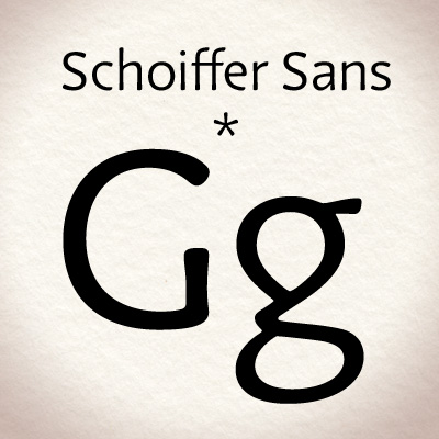
Schoiffer Sans, a rounded humanist sans serif with historical roots is available at MyFonts and Fontspring with 50% off until September 9.

Nice!, that's an insteresting g
This is probably a amateur question:
When designing typefaces like Schoiffer Sans, all the letters shouldn't follow the same shape flow as in the g, a, e, and c ?, Is this an stilistic approach?
Question two: Did you use a especial ratio (like Golden Ratio, Perfect Fifth, Octave.. etc) to decide the max and min values of the rounded borders?
Hi Noisak,
Schoiffer Sans is in fact inspired by a old serif typeface known as Enschedé English-bodied N°6 (see image)
I tried to keep the particular structure of the original 'g', 'e' for instance while modernizing the whole and making it a sans-serif (the 's' is more open and 'humanistic' than the original). The 'n' and 'h' 'are more conventional because it is not a display typeface but intended to set text.
The rounded borders are all made optically, I wanted that the face looks hand-cratfed and that the reader feels the 'ink' as much as possible. That's also why it is slightly flared as well.
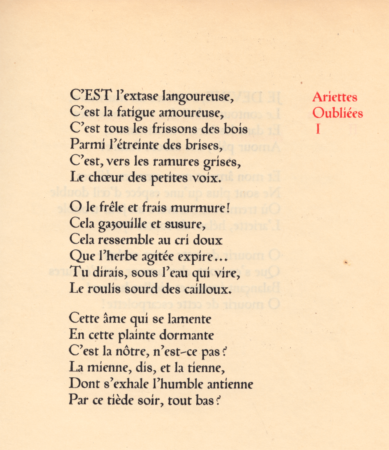
Oh, that's a rare sample, quiet interesting. I like how the L bottom serif play with the e and a curves. That Q, the ? sign and the iacute are cool.
You just made a really distinctive design with Schoiffer Sans. The round borders look great even on a display size and all diacritics are very subtle and coherent.

Very nice, I really like it. You have made interesting choices and the font in the end looks great. Congratulation !
Captured from web.archive.org on 14 Apr 2015. view this capture