Hello there, anyone can help me with this?
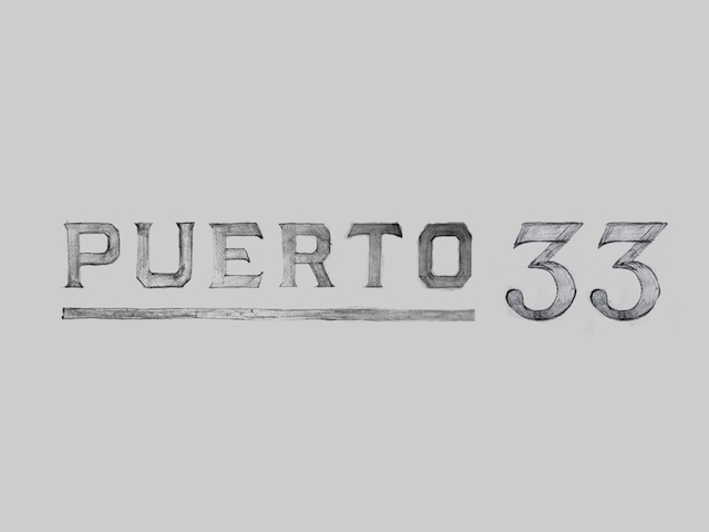
I've been working on the wordmark for an apparel shop. Their consumers are mostly men. However they also sell women clothing. I presented some sketches and they liked them but they thought they were manly, so I was asked to make it more womanly. I can't figure out what they meant typographically thinking.
What would you consider makes a typography in this vein more feminine?