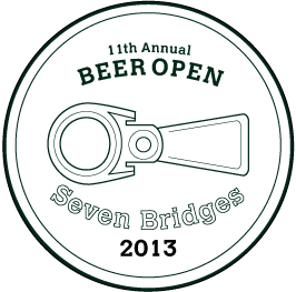
I don't design logos often so this is kind of a bear for me. For a friend to go on a t-shirt or hat.
I would like the type to be more interesting and in tune with the graphic. There is a sort of white triangle between the text and the graphic that bothers me a little Does it bother you? And I don't usually use type on a curve so am I make a major faux pas with that? Are there better faces to use? San-serif, maybe?