Hello everyone.
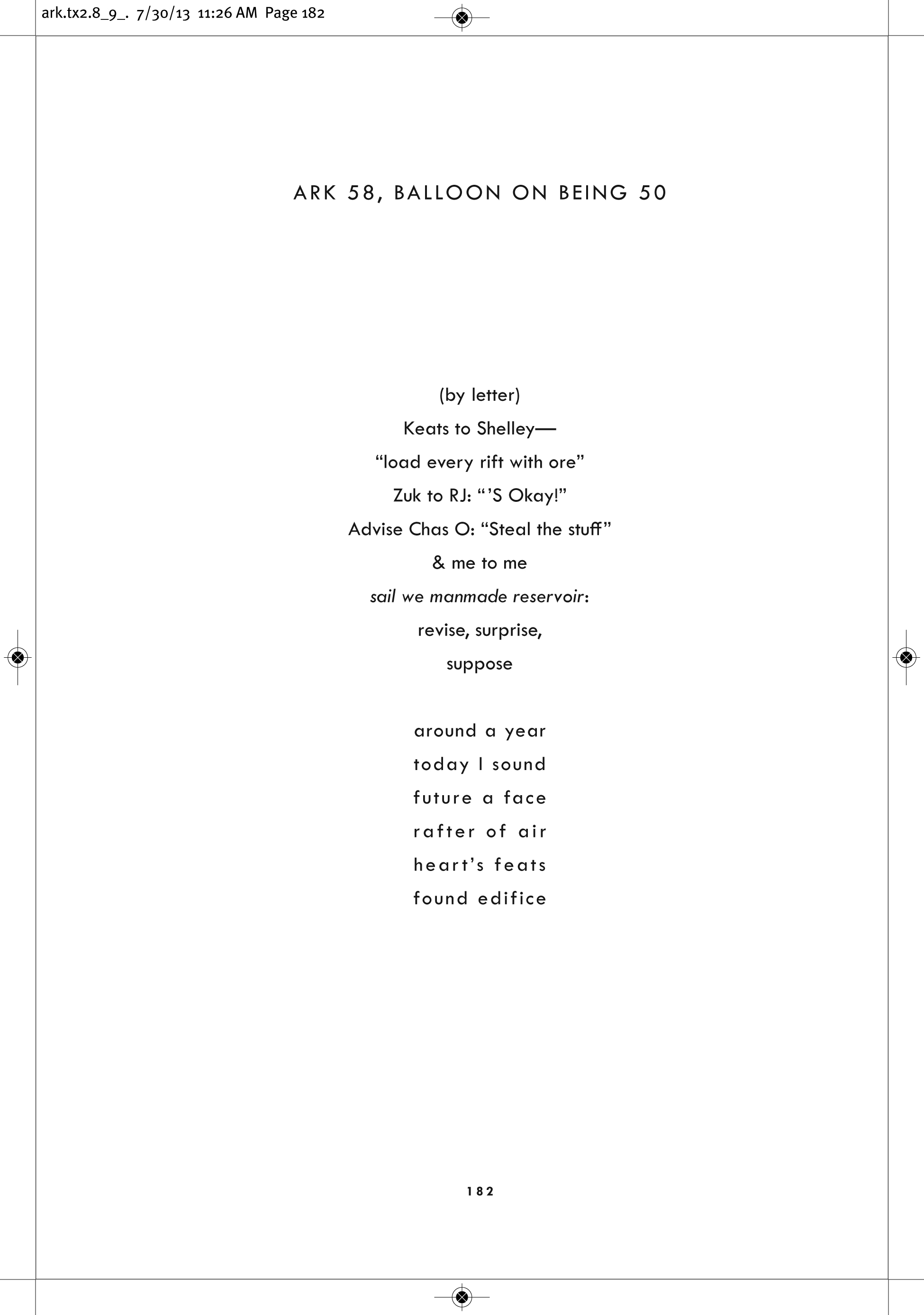
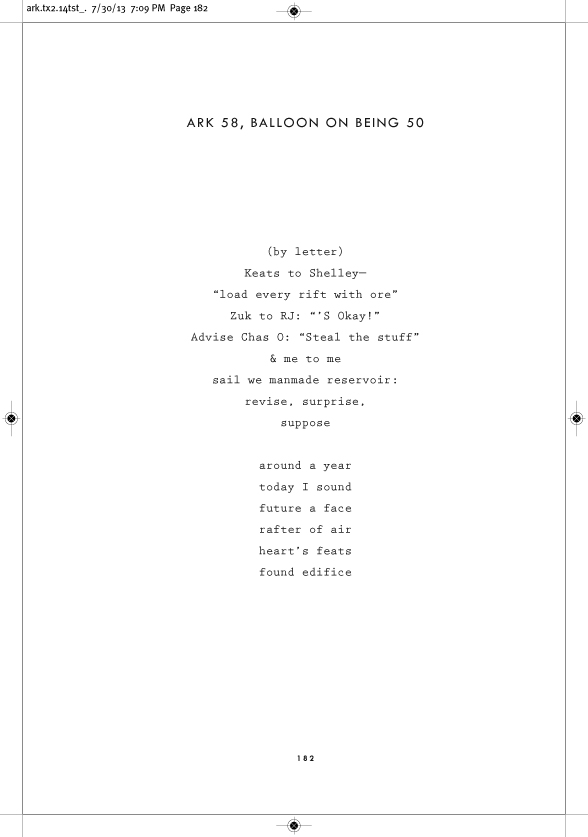
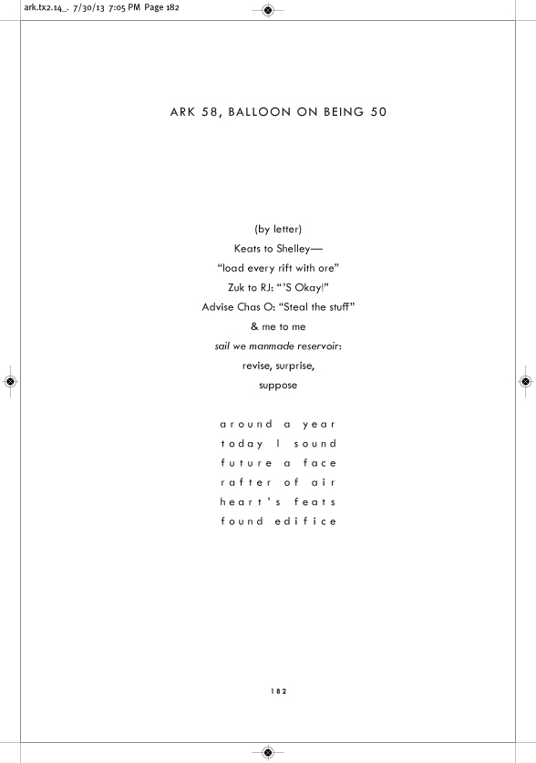
I'm tasked with designing what should be the first serious edition of a seminal work of modernist poetry; the original ms. is unusual in that the author, amid moments of otherwise normative free verse, would insert moments of concrete poetry, and the transitions were typographically seamless because of his use of a monospaced typewriter for both.
My feeling is that to set this new edition in a monospaced face would be to foreground the concrete moments of his book, while uglyfying the "literary" moments (which are not concrete, and which predominate).
So I've tentatively designed the book to be a mix: nonmonospaced lines of poetry, with the concrete moments tabbed and rigid. This "solution," however, departs form the author's original typescripts; furthermore, the transitions between normative type and monospaced type feel *very slightly* jarring, from a typographico-visual perspective. I'm using Twentieth Century Medium, rather than a serifed roman, for the entire interior, to try and allude to the casually vanguard feel of the writing.
The option of using two different typefaces (a monospaced as well as non-) is pretty much off the table.
If any ideas, or condemnations, occur to anyone out there, please share them.