
Hi Everyone,
Can anyone identify the serif fonts used on these stamps?
Serif = Antiqua? (Perhaps a little thin?)
Blackletter = Fette Fraktur?
Thanks
| Attachment | Size |
|---|---|
| SS stamp 1.JPG | 34.98 KB |
Hi Everyone,
Can anyone identify the serif fonts used on these stamps?
Serif = Antiqua? (Perhaps a little thin?)
Blackletter = Fette Fraktur?
Thanks
| Attachment | Size |
|---|---|
| SS stamp 1.JPG | 34.98 KB |

Amazingly, the serif font looks like Palatino — I write “amazingly” because Palatino seems to have been released by Stempel in 1949-1950: how come it is used on an SS stamp?!
I’d say Luthersche Fraktur for the other typeface.

That serif sure does look like Palatino - typeface designed by Hermann Zapf and initially released in 1948 by the Linotype foundry.

Better sample "gsberichter Mi" is pretty clear and does look like some form of Garamond.

Looks like a "Stempel Garamond" to me.
Thanks guys, it's definitely Garamond in some form, it matches up perfectly. Can anyone identify this Antiqua?


The Palatino? Maybe Zapf drew the text for that stamp during his time in France and finished it in '48?

The first one is definitely Palatino, the other two images show a different typeface.
Some sort of Bodoni for the Veroffent.....

This seems really suspicious. The Palatino shown in the sample doesn't match the original metal cut. It matches the later phototype version of Palatino. The original had a smaller x-height/taller ascenders, the top of the /t/ was taller, and the /g/ was more squat. The /6/ and /8/ also match the phototype version, but not the metal version. I'm not sure exactly when the revised phototype version of Palatino was released, but it was not before the sixties, more like the seventies as far as I can recall.

What’s the source of the samples?

IMO 100% fit: Palatino Linotype (Berthold Palatino is a bit different, less contrasty, there are small differences in "r" "f" "e", UC letters are bigger, ascenders are taller.)
Here is a comparison. Top: 14 pt. Linotype Palatino (metal); middle: OP's sample; bottom: 14 pt Linotype Palatino (Linofilm and later).
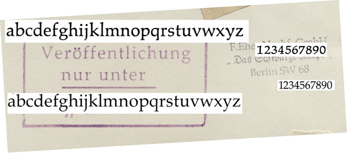
Pay particular attention to the proportions of the /f/, /t/, /h/, /g/, /6/, and /8/.
So what are the dates on the SS documents - Zapf was not doing anything with type until after 1946 so it being Palatino (which I said it sure looks like in an earlier post) is impossible if it is an authentic SS document.
Could the document be fake?

been kindof reading along, and looking up a bit of history. i think it not impossible that Zapf did pen the letters for the stamp. he was conscripted, and worked desk jobs including a lot of writing/cartography/etc as he was basically a poor soldier. the names on the papers seem accurate & traceable. why not?
Ever heard of Occam's razor?
I'll double check the sources tomorrow. I think they are from the Bundesarchiv.
Well done Typophile detectives!!! The first two are in fact post-war archive stamps.
This stamp is wartime:
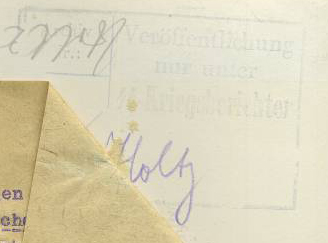
If we could turn our attention to identifying the fonts in this stamp, it would be much appreciated. Apologies about how faded it is.
BTW, thanks for all your help so far. Second to none!

Now that we know that the stamps saying ‘Veröffentlichung nur unter’ were added to the names below that after the war, this is a bit obsolete, still:
i think it not impossible that Zapf did pen the letters for the stamp.
but would he ever have spaced lower case letters?
Sorry, I don't think I was explaining very well.
The initial two stamps were completely post-war, stamps added by the Bundesarchiv or people trying to fake their originality, so now are completely irrelevant. I think you're all right about it being Palantino.
However, the last stamp I posted (Also see below) is dated early 42/43. The upper font looks like Bodoni, the lower I'm really not sure.
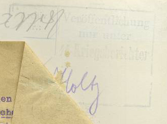
Yes, I understood that. The last stamp you posted does not look like a post-war addition. Some Bodoni may be the case, the other one: I am not familiar with it. The one storey g is rare, checked my photocopied Seeman’s Handbuch der Schriftarten from 1926, it could be something like Schmale fette D-Antiqua by Klingspor. Seemann only shows ‘Hamburgers’ … apart from that I do not have another specimen showing that typeface. Maybe someone else here has?
Captured from web.archive.org on 13 Jul 2014. view this capture

.