
Don't have much information on this, a friend has asked me to find out what it is so it's up to the good people on this site to help me out.
Thanks
| Attachment | Size |
|---|---|
| Carmelle.JPG | 31.28 KB |
Don't have much information on this, a friend has asked me to find out what it is so it's up to the good people on this site to help me out.
Thanks
| Attachment | Size |
|---|---|
| Carmelle.JPG | 31.28 KB |
Cooper Black is similar, but not quite an exact match. It appears to date from the early part of the 2oth century--do you know the year?

A logo for Columbia records from 1923 in somewhat similar lettering to Carmelle, but without the bulge below the baseline. An interesting design 3 years after Cooper Black and 2 years before Goudy Heavyface.
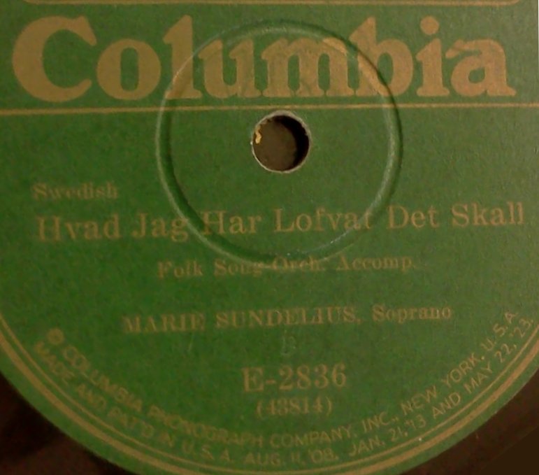
Captured from web.archive.org on 4 Aug 2014. view this capture
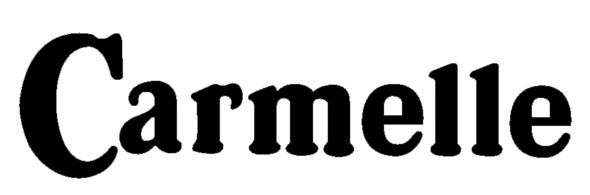
Carmelle has bulb serifs like Cooper Black but othersise is a long way from Oswald Cooper’s type designs of 1920. It has about the width of Cooper's Cooper Black Condensed, a “condensed but not squeezed” variation on the Cooper Black theme released in 1925.
Cooper Black Condensed available from Wordshape is similar in width to Carmelle.
But Cooper Black, regular or condensed, is too heavy for Carmelle.
Bitstream includes a bold weight in its CooperBT, but the width is wrong for Carmelle.
The photo-compostion era produced some alternatives to Cooper, such as Photo-Lettering Inc.'s Cavanagh Hamilton, but the ones I have seen are not much closer than Cooper.
Does your friend have any idea where Carmelle came from?
Logo? Advertisement? When?
If it's a modern logo it would be feasible to compress Cooper Black to the width of Carmelle, which would more or less match Carmelle's bold weight, and edit letters to match this design. Extensive editing would be required.
Don