
dear typophiles,
i write my ‘reading dissertation’ about hebrew secondary styles. now i am looking for hebrew type designs that create a set of styles (through structural change and within the same weight). i know about ismar david’s david (and linotype’s david hadash), henri friedlaender’s (unreleased) attempt of hadassah cursive and ben nathan’s days and nights. does one of you happen to know other examples / attempts that try to create a complementing style for highlighting within texts for continuous reading ?
many thanks in advance, nicole




william,
yes, i know about the hebrew cursive (what i didn’t know was that it’s called ktav yad – thanks ;-).
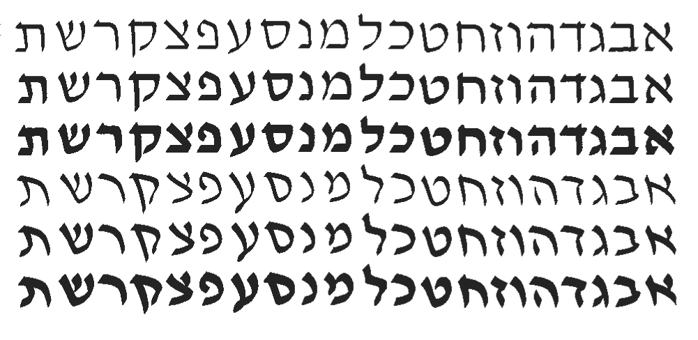
i actually designed a text typeface that consists of three styles – an upright (hebrew square script), a cursive (like david’s cursive) and a script (like the handwritten shapes) – for both latin and hebrew script.(http://www.typefacedesign.org/resources/A5specimen/2010/NicoleFally_Miss...)
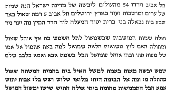
so i am particularly looking for text types. i know only one example where the hebrew cursive was designed as a secondary style. it is from another reading student and was designed a couple of years ago. unfortunately, i don’t know her name yet and only have this low quality photograph.
you write, the hebrew cursive has its own tradition. do you know where its shapes come from ? i could hardly find information about its origin. stephen lubell writes, ‘The cursive script has been in daily use for several centuries amongst various Jewish populations and continues to be used in modern Israel. In contemporary Israeli display typography and lettering for advertisements, the cursive script has come to be used as an element of graphic differentiation, due to its distinctive forms and calligraphic feel.’ (The Hebrew Typeface Designs of Zvi Narkis)
but that’s more or less all i could find about it.
michel,
thanks for the link and the example !
i think, the rashi script is a possible variation. as far as i know, it was and is closely connected to religious usage and evokes religious associations. that’s why i didn’t consider it to be an option for the design of a style that is included in a text typeface that should be ‘neutral’. i might be wrong with that assumption !?
mike,
thanks !
i like these ligatures too and hadn’t yet seen them.