Hello everyone. I am new; hopefully I am posting under the correct topic.
I was given a piece of printed material with the word “Time” in the title.
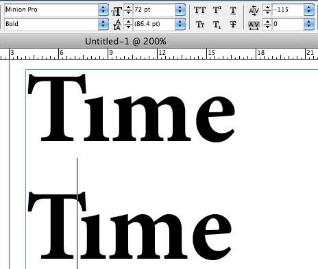
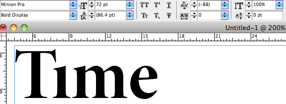
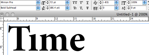
It is set in Minion Pro typeface, and the capital T and small i seem to be a ligature because the dot of the i is not present, and the bottom serif of the i sits within the width of the T hat. (please refer to the attached jpeg)
I have looked over the entire glyphs of the typeface several times, tried selecting both Ligature and Discretionary Ligature.
None of them seem to give me the result.
What is definite is that the word is only within Minion Pro family (glyphs included), in one text frame only, the letters are not kerned, are evenly tracked, and the i is not rendered in any way to have the dot removed.
Lastly, I have also tried using the number 1 and Latin small dotless i; however, none of the number 1 resembles the i on the page, and latin dotless i would need to be either kerned or tracked close to the T, but I was told that these two actions are not involved.
Any help is appreciated. Thank you in advance.
*Please see the attached jpeg of what the word supposedly looks like; I created it using Latin small dotless i, reduce the tracking between T and i.
| Attachment | Size |
|---|---|
| Ti ligature.jpg | 39.68 KB |