

Hello all,
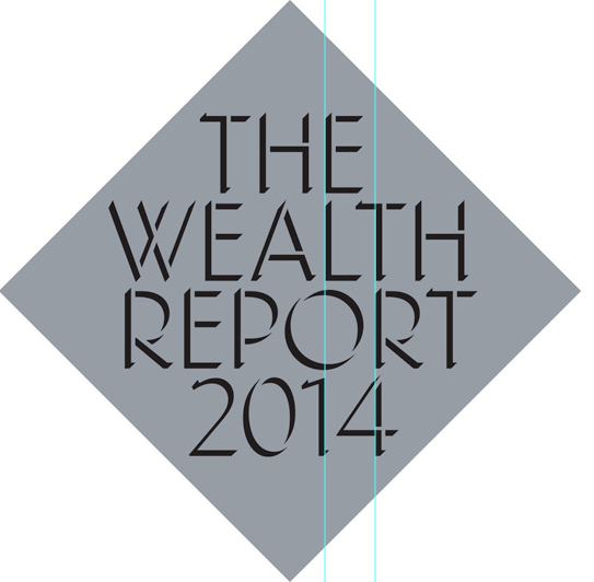
I've been looking at this for too long! Can people kindly critique the brand mark which will be reproduced foil block on an uncoated stock. In particular I'm having issue with centering the text and the kerning.
Thanks
Darren
Hello all,
I've been looking at this for too long! Can people kindly critique the brand mark which will be reproduced foil block on an uncoated stock. In particular I'm having issue with centering the text and the kerning.
Thanks
Darren

Working from the position of Wealth.
2014 – right by a fair amount.
Report – right by a little less.
The – a gnat’s to the left.
But I am not really comfortable with the position of 2014, I think the other text needs to be lifted off it a touch, especially the R4 and O1 combinations.
Depending on the final size and the budget you might be asking quite a lot of the blocker/finisher.
Tim
Pretty much agree with timd; might help to make the type a tad smaller and add more space between lines.

I like the tight line spacing, but I agree with what timd says.
Thanks that's a huge help - hows this working?

I think you have uploaded the same file in error.
Tim
Indeed, well spotted!
Sorry here it is:


Much better, but I find the reversal of this style disconcerting, as I’m reading the “shadows” as foreground, not the implied type face, which draws attention to the thin edges as if they are serifs, which seems strange in a sans face; the effect is especially strong in “T”, “2” and “1”.
Also, I’ve always preferred the illumination to come from top left. I believe that is the standard.

REPORT should still go a little further right. You need to compensate for the space created on the right by the T in REPORT. Something like this (ignore colour change; Photoshop being weird).


I think report is fine but 2014 is left, needing to look more centered to the diamond shape, then the THE all the way up top by the time you get to the bottom.
Please disregard my previous criticism.
On further reflection, what was initially identified as a bug may perhaps be a feature.
Opinions anyone?

I think the relative centering is good (especially after John's amendment), but I think the whole text block needs to move a touch right within the holding shape.
Thanks all. Perhaps we might go with black text on the foil block to make the illusion work. Any final thoughts?

I think the white type looks better. The black doesn't give you enough contrast against the background.
bear in mind the silver will be a foil block and the ink black, I think the contrast will be about the same.

I still prefered the white text.

To me, I would prefer a more structural approach, and you are very close.
1. Shift the word "THE" left until the E aligns vertically with the L in WEALTH.
2. Shift the word REPORT a tad right until the vertical stem of R in it aligns with the vertical stem of T above it in WEALTH;
3. shift 2014 a tad right until the vertical stem of the 4 aligns with the vertical stem of the R above it in REPORT.
This will also make it feel a bit more like a table as in balance sheet.
> the silver will be a foil block and the ink black
> I think the contrast will be about the same.
But most foils are reflective to some degree, and their brightness will vary depending on what they are reflecting. A matte foil might help but I'm not sure it'll create the effect you're after.
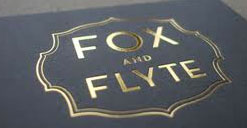
But even if the contrast is sufficient, I still like the white version better.
Thanks Dezcom - works really well. Point taken James
Thanks everyone else as well
Captured from web.archive.org on 6 Aug 2013. view this capture