Typophile

Type Anatomy Term

Sevag B. Martouni

Is there a special term for that part of the letter /u/ on the right(circled) compared to the one on left.

I'm also looking for the earliest examples of fonts with this kind of design at that part of the letter /u/. How old could the practice of designing the letter /u/ or /n/ with this specific style be or it has been there since the beginning of sans-serifs?
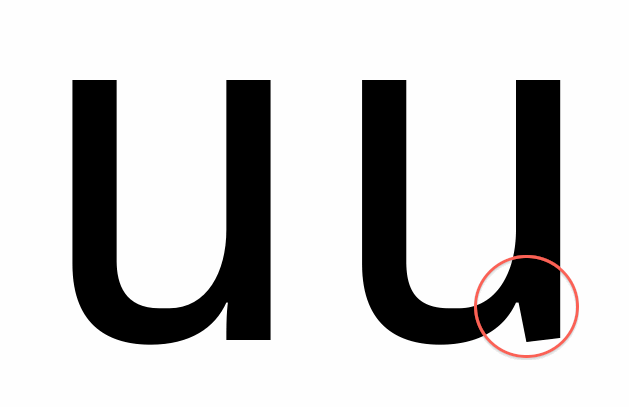
I am not certain there is such a term, but I would like to suggest “nick”…

That sounds about right.

The original question is unclear. Does it refer to the white space (yes, nick is a good word for this) or to the stem section (what I would call, in both letters, a spur)? Hence I would describe the one on the right as a nicked spur.

Nicked Spur it is, thank you gentlemen.

A spur is a tiny serif that implies an entry into the stroke with some sort of engraving tool.

I think you should call it a "sevag".

Captured from web.archive.org on 20 Aug 2013. view this capture