Looks like an advertisement showing well executed lettering in a fashionable style from about 1900-1910.
Note variations such as the thickness of the leg on R. Also note the adjustments to fit the Cartouche: the top lhs serif on M is angled so as to not disturb the leaves; and the top of the final S is squeezed so it does not overlap the edge.
Someone may have made a font based on the lettering, but I have not seen it. Nick Curtis made a lot of fonts made on less information.
The serifs are in a style sometimes called Mansard or Detroit.
The terminals on the S are in a style sometimes called beaked. This is found in some fonts based on designs of the era such as Verona, which also has E in a style similar to your image.
Don

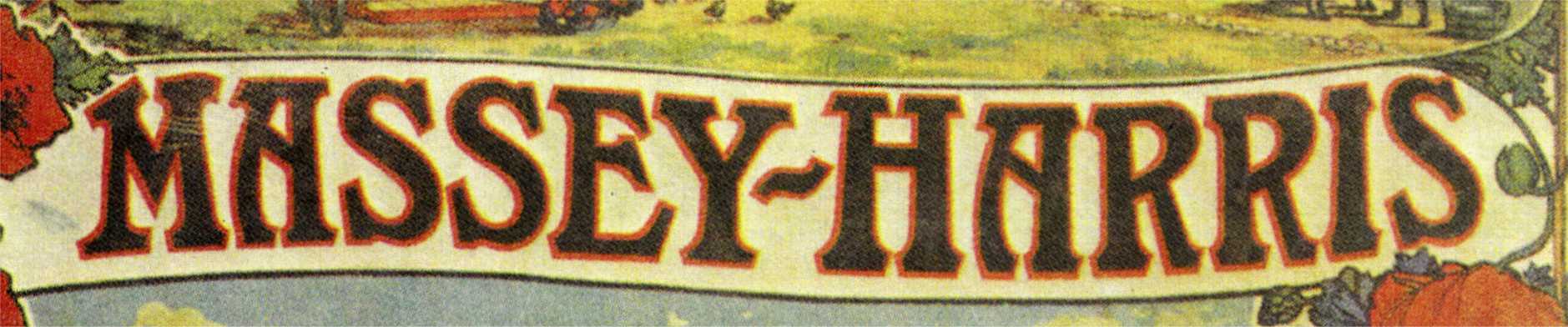

Looks like an advertisement showing well executed lettering in a fashionable style from about 1900-1910.
Note variations such as the thickness of the leg on R. Also note the adjustments to fit the Cartouche: the top lhs serif on M is angled so as to not disturb the leaves; and the top of the final S is squeezed so it does not overlap the edge.
Someone may have made a font based on the lettering, but I have not seen it. Nick Curtis made a lot of fonts made on less information.
The serifs are in a style sometimes called Mansard or Detroit.
The terminals on the S are in a style sometimes called beaked. This is found in some fonts based on designs of the era such as Verona, which also has E in a style similar to your image.
Don