
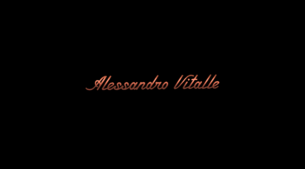
What is it? May be just lettering...
http://typophile.com/files/22222_0.png
| Attachment | Size |
|---|---|
| 22222.png | 44.63 KB |
What is it? May be just lettering...
http://typophile.com/files/22222_0.png
| Attachment | Size |
|---|---|
| 22222.png | 44.63 KB |

and the sad part is, i've seen something like this before but just can't get a lead on id'ing it.
Can't recognize either unfortunately. Some I like: Tamara, Script Stream, Kidorama, Matinee Idol, So Prolix, Brasserie, Learning Curve, League Script

A rounded easy to read script with almost no variation in contrast. There are quite a few that resemble your sample, but I have not found an exact match. Ryuk's list has some good alternatives. An early script in this genre is Monoline Script MT from 1933. The flavor of your sample seems to match a font by Mark Simonson based on an old movie title. It's called Lakeside.
Don
Can someone please help me identify what font this is?
Thank you!
tracy88:
If you want to ID a font, you should start a new thread, not jump into another person's request.
Don
Thx!
You're welcome.
This would have been a nice font to look at more closely.
Unfortunately, none of our typophiles seems to have been able to find it.
I do wonder, however, if the source of the image might help, e.g. store sign, magazine advertisement, website, game, label.
Don
I haven't idea about this. But it's look interesting.
hr assignment help.
News about this lettering.
It's a trademark for "Alessandro Vitalle" in the form of "the wording Alessandro Vitalle in a stylized form" by A & V Casting Inc. in New York, NY, 10018. Filed in the category jewelery products, on July 02, 2013, serial number 86000442.
USPTO source:
http://tsdr.uspto.gov/#caseNumber=86000442&caseType=SERIAL_NO&searchType...
After a rather full search of possible fonts I have fond nothing that matches these letters.
I conclude that there is no font that matches the "Alessandro Vitalle" logo/wordmark and that it is lettering designed to create a corporate identity in the jewelery products industry.
Don
Captured from web.archive.org on 5 Apr 2015. view this capture
The lower case on this one is rather close. It's Terital-United which is named after an Italian overcoat advertisement.
Don