Typophile

The First Spiekermann Dictum

Jared Benson

Because we're talking about it on Twitter, I'm curious to see how many of you are aware of the First Spiekermann Dictum? I imagine that anyone who's set more than a few lines of type has come across the phenomena where a descender in a line of type clashes with the ascender in a second line of type.

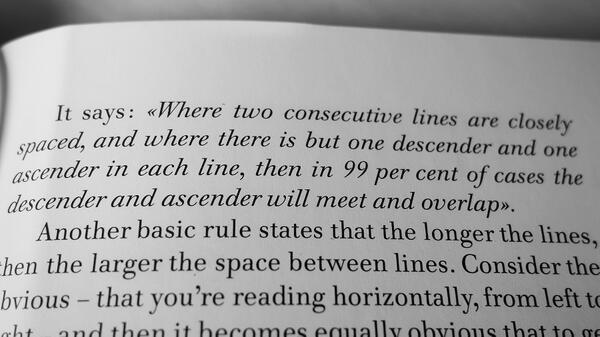
As written in Rhyme & Reason: A Typographic Novel, the dictum states the following:
Any good stories on your encounters with the First Spiekermann Dictum? What would be your approach when it occurs?

My approach to these incidents is to rework the two lines so that the two touching elements look as natural as possible, blending together well. My one exception to that is if the touching is quite minimal, then I will rework the two lines so they don't touch.

I'd guess that it's easier to handle this for some languages than others.

Small cap it. ;)

Sounds to me like a subset of O'Toole's Corollary of Finagle's Law: "The perversity of the Universe tends towards a maximum."

Spiekermann?

Buttered toast?

Spiekermann?

Your best ever, John!!! Why did I ever doubt you?

Odd. How could that possibly happen, unless the ascenders and descenders were cast as overhanging kerns?

Of course, with phototypesetters, one can specify negative leading, and one can do similar foolish things at one's own risk with computer typesetting... but if that happens by default, it's bad programming.

How could that possibly happen,

Spiekermann’s is a phototypesetting-era dictum.

«Where two consecutive lines are closely spaced . . . »

I was being slightly sarcastic, but of course even with "closely spaced" included, closely spaced should mean zero leading, not negative leading: that is, a phototypesetting system should require you basically to hit the red override button before you can space lines that closely.

Look at the illustration. Erik is talking about a particular style of display setting.

The telling line is, "touching is allowed if it looks better"

The spelling error in ‘exception’ bugs me more than any touching extenders, I have to admit—at least in this particular setting.

@R: Good catch. Everyone was so focused on the touching bits they all missed it, including the proofreader -- and that's assuming they had one.

Or maybe there's a Spiekermann Dictum that covers that?

I think that "exeption" was on purpose to make the "p" line up with the "i" on the next line. That the word exception was the misspelled word further emphasizes that "exeption" looks better than "exception" would have in the same setting. This is a visual pun of the highest order and I heartily applaud.

[to follow]

How would it look with the dot of the "i in "this" removed? Also as a typo ("thıs"), or would the "p" tail be enough to mimick/obfuscate it?

Another thing that could have corrected it and allowed spelling "exeption" correctly: simply change "this" to "the". It would still read right and everything would be fine.

Spoken like a true editor :-)
The point of it is the on-purpose misspelling of the particular word "exception"

"exeption" looks better than "exception"

I think that's wandering into the realms of post-rationalisation. There are better ways to engineer an ascender descender clash than to purposely introduce a spelling error. If it was intentional then that's just sloppy.

You are certainly allowed to disagree with my assessment ( I have no idea what was really going through Herr Spiekermann's mind at the time. I really do think you have gone a bit unfairly overboard with the "sloppy" comment

It's witty!

I'd like to say ... Give him a point and he'll think he's a typographic ruler.

But I won't 'cuase it's just a poor attempt at any sort of humor.

:)

I'm pretty sure you don't become a typographic luminary by putting aesthetic niceties before correct spelling, but as you say, there's no knowing exactly what the intention is here.

If we said for the sake of argument that it was an unintentional error, then using the term 'sloppy' is fairly benign isn't it?

... there's no knowing exactly what the intention is here.

Ask Erik?

I just sent Erik an email.

That book was printed 30 years ago and nobody has seen that mistake until now, for a mistake it is. Paul Stiff and myself worked on this English translation of the German original and we never noticed that typo. Quite exceptional to have escaped an expert audience all these years.

If I had the German original here I would check how it was handled there, but i remembered that we just set the sentences the way they came and clashes happened, thus the dictum.

The Spiekermann Dictum, however, is to be found on the top of the right-hand page, not that headline setting. It doesn’t apply to text setting where – even without additional leading – most descenders won’t physically touch ascenders below, although they might still look uncomfortably close at times. But if anybody has ever set a headline for a package or some other display purpose where two or more lines have to be close for impact and/or space reasons, they will have come across this phenomenon. In other trades this is simply called “shit happens”.

Thanks, Erik!

I stand corrected.
In the words of the late Emily Lattella, "Never-mind" :-)

Actually, I stand corrected.

How funny! A misspell by the holly name "Spiekermann" was going to be almost sanctified if Herr Spiekermann hadn't stand corrected! There is still, though little, hope as long as children like R. exist who are brave enough to say "Spiekermann is naked!".

@gezegen:
not sure what you’re implying: I make as many mistakes as the next guy, especially in English, which is not my first language. And I appreciate other people finding them so I won’t die stupid.

If I were to have a first dictum, it might be this: the typo will always occur in the short piece of display setting, which no one will think to proofread.

On a similar note, during my undergrad, I was asked to design a title page for a book titled “TRADITIONAL TYPOGRAPY.” My choice of title. My professor and I went through a few rounds of revisions with tissue markups advising me on kerning &c, after which I submitted the final version, for which I received an A+.

It was only after I got it back that I noticed I had actually misspelled the word TYPOGRAPY. I brought this to my professors attention, who’s first language was also not English, and we both laughed. We were so focused on the kerning we neglected to notice the spelling. I believe the expression is “not seeing the forest through the trees.”

This is truly a thread for the books — pun intended.

(he let me keep the A+)

And I’d wager that everyone here has a similar story.

Yup. Author who misspelled his own name on the title page. Quite painfully, as he only saw it in the press proofs, so the sheet had to be re-printed.

In more than 45 years of having stuff printed, I have yet to get one piece back from the printers (or finishers) that hasn’t got at least one mistake in it. And I’m not talking about bad line breaks, but major, often embarrassing typos, omissions, wrong fonts, missing illustrations etc. The closer you work with it, the farther it gets from your critical eye. Show me someone else’s work and I’ll spot a typo or similar misdeed immediately.

One of the classics is the Hartley & Marks edition of Gerrit Noordzij's Letterletter, on the spine of which his name is spelled Noordzig.

The one that pains me most is in Language Culture Type. I managed to drop a letter from Adam Twardoch's witty chapter title, so it ended up as 'Picked herring...' instead of 'Pickled herring...'. Neither I, nor the editor, nor any proofreader spotted it. Adam, of course, saw it immediately, after the book was printed.

I also recall a misspelling in 100pt type on the cover of a high Anglican service booklet, also missed by numerous people until the church secretary opened the box from the printers and spotted it immediately. In that case the text was running from bottom to top up the side of the cover, and the mistake might have been easier to spot if anyone had bothered to rotate the proofs. I don't remember exactly what the mistake was, but I do remember all the covers being carefully removed and new ones affixed.

John, I just now looked at my copy of the Letterletter book! There it is, plain as dzig! ;-)

And I’d wager that everyone here has a similar story.

This book I designed was published in 1973. It had a misprint right on the title page, in Times New Roman bold. The point size was 72 or 84… No one noticed it. The book sold out in a couple of weeks.

As a graduate student I was so excited to learn that an article I wrote would be published in a prominent Dutch journal. My name in print! But when they sent me copies of the issue, I found that my first name was misspelled.

I know that I read 'exeption' above as 'exception' without even hesitating.

I regularly see publications go to print with random w's scattered everywhere, because of the InDesign shortcut.

There are random "Z"s around for the same reason ;-)

Is there such thing as a typeface with ligature glyphs designed to replace overlapping ascenders and descenders? That’d be an interesting challenge for an MA of Typeface Design at Reading University graduate student.

I'm now thinking it would be coolio if there were typefaces (especially Display faces) with ligatures designed for overlapping descenders and ascenders, and overlapping anything else for that matter.

Or perhaps even better ...a script one could use in Adobe products which the user could simply highlight the characters and make it so.

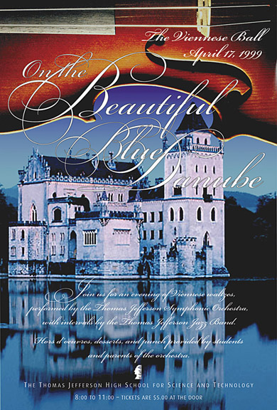
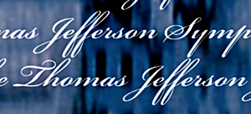
Particularly with swashed script fonts, a certain amount of overlap is expected among the flourishes. Here is an example:

...and of course, "Jefferson" is trying to crash into "Thomas" just ahead of a "Symphonic/Jefferson" pile-up.

It appears to only be a minimal fender-bender though ;-)
Emanual, Good thing there was no Bach playing there, otherwise, there may have been a Carl-Phillipp ;-P

When Geraldine Banes was at Microsoft, she and I spent many hours discussing inter-line contextual glyph processing (also dynamic spacing around intrusions from adjacent lines, which would be very handy for publishing Sanskrit texts in Tibetan script), but never managed to generate much interest from line layout folks. The computational overhead is high, and hence the impact on performance would be considerable.

Interesting. From the font design side, how would you even get a font to "know" there is a line break? Can it be done?

The issue isn't getting the font to know there's a line break, it's having the line layout engine keep track of where things are in adjacent lines and applying appropriate layout features when specific conditions occur. It's a bit like mathematics or some complex script layout, in that you can't rely on font-level context rules, but need a layout engine to trigger the lookups.

@Maxim: yes, I see that the R is backwards ;-)

I can see what’s wrong with that headline: The R is backwards.

Naslediye instead of nasleniye?

OK, I'll try: наследение

I think you've got it. Maybe a double N though (nasledennie).

Ah, no, checking on Google shows you're exactly right.

When talking about the relevance of the First Spiekermann Dictum and guessing how often that occurs, we should remember that Erik stated it back in the days of phototypesetting. In the case of Erik and many of his professional colleagues in mainland Europa and the UK, this was typically done on Berthold machines. On these machines, all the fonts had the same cap height. As a consequence of this, the real body sizes varied. Type size was defined in mm cap height and line feed in mm. The Berthold type specimen specified a minimum line feed for each typeface in a range of sizes from 5–16 p for kp, Êp and Ex-height. Because not all typographers liked to calculate and write their typesetting instructions that accurate, but simply wrote things such as 10/10p, ascenders and descenders would touch when applying this instruction to typefaces such as Syntax or Futura. You can imagine that mistakingly touching ascenders and descenders were quite common in those days. The large phototypesetting chain of Eduard Bos in Holland tried to cope with this by advising so-called line feed factors for each typeface family. These factors were communicated in the specimen books of the studio as ‘A’, ‘B’ or ‘C’. Typesetting operators would then calculate the appropriate line feed from that factor. Remember that back then, there were no Wysiwyg screens with an accuracy that could display the difference between 10/10 and 10/11 p … Of course, not all customers had these specimen books, let alone that they studied them thoroughly. Many of them learned by trial and error. Like me. Normally one would make such a mistake only one time because phototypesetting was quite expensive, but that one time was usually enough to make shure that you would never forget such a thing as the First Spiekermann Dictum in your life as a typographer …

When you want to have a today’s experience how things sometimes looked like back in the good old days of phototypesetting, simply pick Adobe Futura from the font menue and specify a line feed that is identical to the type size. Be shure to write some lines with a few ascenders and descenders … there you are!

Nevertheless, blaming the entire situation on Phototype is hardly fair since it's kinda dead and not here to defend itself. Ghost said something about "...double 'xposure, 'n what'd'dayno." (...ghost still smells like fix).

Meanwhile, though, I guess they get dictummed daily as punishment, everyday people go on writing headlines with descenders all the time. What about them? How can they be stopped?

I did not intend to ‘blame’ it on phototypesetting :–) Some of the debaters here seem to suggest that such a thing as colliding ascenders and descenders hardly occurs. Auto linefeed solves some of the problems but also brings in many new ones. And cannot solve all of them. Your mentioning of headlines with ignored descenders shows that the problem is still present.

I was kidding.

How many dictums does Spiekermann have?

Captured from web.archive.org on 15 Apr 2015. view this capture