
Hello Typophile community! Long-time listener, first-time caller, yada yada.
I could really use some help identifying this....well, ugly typeface.
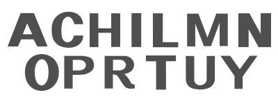
It's the logotype of a client of mine (words scrambled to protect their identity). I'm doing a marginal "refresh" on the company's brand. However, not only are they refusing to let my company select a new typeface for them, they can't even tell us which typeface we can't change. Since they have no idea.
I've been racking my brain and going through the usual online channels (identifont, etc.), but no luck. I was really hoping someone here might be able to help.
For clarification - the specimens you see before you are all the characters I have to work with. No lower case, no punctuation.
Thank you sincerely in advance for any clues.


The letters above are single instances of the entire company's name and sub-title. Many of the letters above are repeated multiple times (c, o, i, r).
My best guess at this point is that it's actually Arial Narrow Bold, scrunched down to roughly the natural x-height (to essentially make a "wide" version of the type), and then poorly retraced from a low-resolution jpg version of the logo, likely taken straight from the corporate web site. I'm not dealing with a client who has a history of valuing properly-handled or executed artwork. They have several different "versions" of the logo in active use, using completely different typefaces, and they don't seem to see any differences between them. The type samples above come from what they have declared to us was "the official logo."
The crossbar of the H and the bottom bowl of the R and P were what tipped me off to it being a scrunched manipulation of a narrow case. The curvy leg of the R seems to be a custom element. Whether intentionally drawn that way, or just a clumsy evolution from multiple re-tracings I can't really say at this point.
What do you guys think? And thanks again for the responses. Much appreciated.