
Any ideas much appreciated!
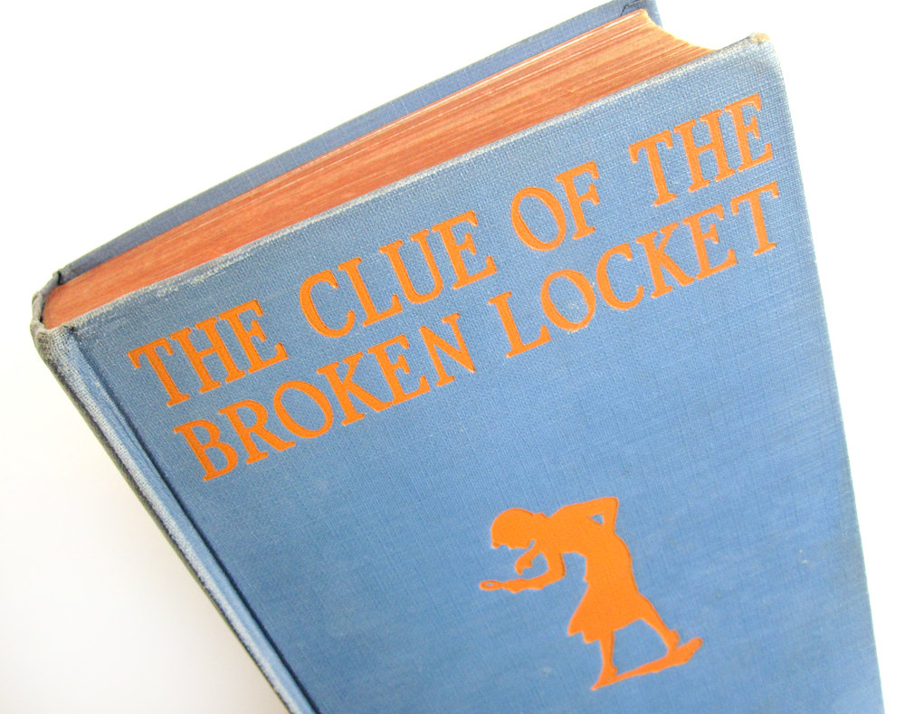
Any ideas much appreciated!
Some of the Usherwood / Red Rooster Collection fonts seem to be getting close, any other clues out there?
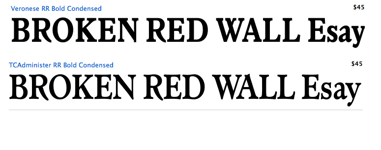
thanks
M

I'm guessing handlettering, based on the evidence of slight variations in the letterforms (e.g., the T in locket is wider than the other Ts). Cheltenham has a similar feel, though you'd have to modify it to get the cockeyed O and the high-waisted K.
This example was foil stamped, not printed, so the binder would have had to make a stamping die. In the 1930s this could have been done photographically, so it would have been just as easy to make it from handlettering as from a repro proof of type. Book titles were commonly handlettered in those days when there were far fewer typefaces available in the large sizes needed for book covers and jackets.

I agree with PublishingMojo that it's hand-lettered, as were almost all book covers from the era, and with his explanation.
Still, the lettering is interesting. I adjusted the geometric distortion and improved the contrast so we can better see what we are trying to match:
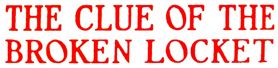
Thanks for the ideas and knowledge, I suspected this might be a hand-lettered quirk, quite like the effect of the reversed 'O'!
M
You're welcome.
I am assuming the lettering is from the first edition, 1933.
The Nancy Drew books began in 1930. This one is number 11. Five more in the 1930s. If the publisher, Grosset & Dunlap, was seeking some consistency in the series, the lettering on at least some of the other 1930s books might in the same style. The lettering would probably be sufficient for a font designer to make a titling font that would have this particular retro flavor. IMHO there is no shortage of people able to use modern font-making tools who are looking for interesting material.
Don
Captured from web.archive.org on 2 Aug 2014. view this capture