Hi,
first post here - I'm delighted to see so many famous names hanging around :)
On to my humble request...
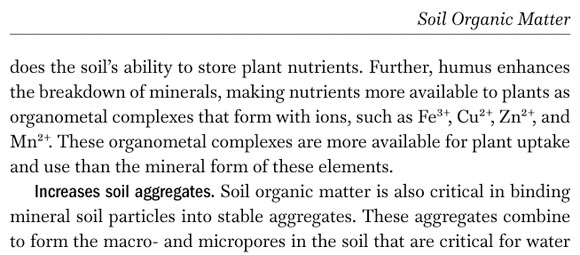
As a typophiliac, semantics-obsessed scientist I frequently typeset texts containing various scientific terms and notations. Whenever publishing guidelines are not strict, I usually opt for some pretty typeface I deem suitable. However, the choice appears rather limited due to a few characters absent from many, many fonts, even the most expensive or carefully crafted ones: a few greek letters, a superscript "+". Remember your high school chemistry lectures and these awful equations? (CaCO3 + CO2 + H2O = Ca2+ + 2 HCO3) Remember the Czernobyl disaster and its bunch of alpha, beta and gamma rays? Well... most typefaces cannot accurately convey this information.
I hear you say "just use the 'superscript' 'subscript' functions in your word processor" and "type a, b, g and switch to Symbol font". Unfortunately, that's not how things should work, for both practical and ethical reasons. Practical: a 'g' is a 'g' is NOT a 'gamma'. Copy-paste between various apps that don't care about fonts, you end up with hard-to-decipher sentences where one can not distinguish between what was a greek letter and what is a latin letter. Let your text be indexed by Google or whatever scientific tool you use, everything is stored as plain text - your pretty 'gamma G' is actually some meaningless 'GG'. From a more "philosophical" viewpoint, characters that look exactly similar may have very different meanings, hence the need for specific rules and notations (e.g. in Unicode) - 'hyphen' is not 'minus' is not 'dash', semantically. A superscript '+' in a formula is not just a '+' above baseline; it conveys a very different kind of information (one is a logical operator, the other a symbol for ions). Even to a trained chemist, d13C(CO32-+Ca2++14C6)2 asks for misreading.
I know designing a good typeface is a lot of work. Let's not ask for every font out there to support polytonic greek and the full unicode charset. But... everytime you neglect a superscript '-' or '+', everytime you omit those few greek letters used routinely by scientists worldwide (alpha beta gamma delta epsilon...), you make your pretty baby look less cute to a small but interesting part of the publishing community... ;)
Nothing could excite me more than Hypatia Sans Pro (or any other great Adobe typeface) getting the 'sups+' it deserves... (Solace: Canada Type just released Aragon ST, it's next on my shopping list!)
Off-topic: anybody having experience with upgrade policies at Adobe? I recently bought the Italics pack to complement Hypatia Sans Pro, and I end up with much newer versions (2.072?) than the old Hypatia upright weights that once came as a goodie from Adobe (1.008). According to the readme files, many quirks were fixed inbetween. I haven't noticed striking discrepancies yet but I'm worried mixing both packages could lead to visual glitches. Still, couldn't find any info about discount upgrade paths for fonts at Adobe.com. Agreed, I'm dreaming aloud :)
Cheers