

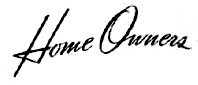


Helping out a photographer friend who is working on a pro bono book project. Any help is much appreciated!

In the 1940s there was very limited choice of fonts, no digital, not even any phototypesetting, and much was done by hand lettering rather than a font. We can locate fonts to match everything in your image except Home Owners, which is a script on a non-geometric arc. I checked my collection of pre-1950s typescripts and while some are close, none match precisely. I suggest Home Owners is probably no nonsense lettering created by the Sears art department.
Possibly Linotype machines were used as part of the production of the 1940s Sears catalogs -- if any one has any info please speak up -- which would suggest the fonts are from Linotype. For the sans fonts, there might be something closer but its worth checking the Trade Gothic fonts as digitized by Linotype. I can't discern the details of the serif font. It could be any of several including Centennial as digitized by Linotype.
Hope your friend succeeds with the pro bono book.
Don

COVER = Alternate Gothic No 1
SALES OFFICES = Futura
Home Owners: I said none of the pre-1950s typescripts in my collection were close matches. If you want this style for more than these words, then you should consider adapting an existing font, even if it was produced more recently. Some things to look for in such a font are fairly low contrast stokes that are not to heavy, angular, and no flourishes. Not really that close but might do in a pinch, Lamplighter Script Marquee, Lamplighter Script, Coronet, Vladimir Script.
Don
Captured from web.archive.org on 11 Oct 2013. view this capture