
Lifted from pic in today's business news report that Hudson's Bay may buy Saks.
So I wonder what fonts or fonts have the comb over ampersand shown on the Saks & Company street level lettering?

Don
Lifted from pic in today's business news report that Hudson's Bay may buy Saks.
So I wonder what fonts or fonts have the comb over ampersand shown on the Saks & Company street level lettering?
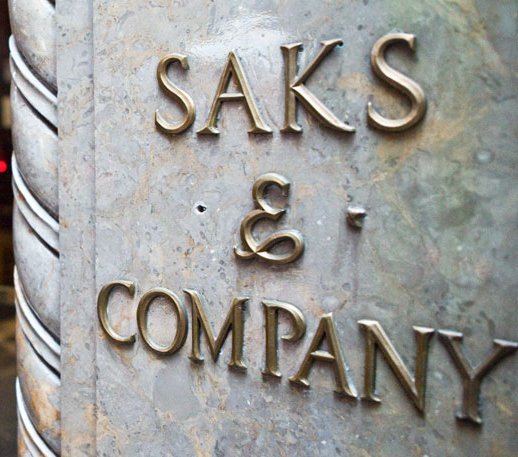

Ah, after almost ten years somebody else has finally noticed that beauty.
I haven't seen that form anywhere else, ever.
And "comb over": funny!
hhp
So this stumps the typophiles?
Presumably this lettering style dates to when the store was designed by department store specialists Starrett & Van Vleck and built in 1922-24? The bronze letters may be more recent but the ampersand matches the style of the large letters over the entrance.
See photo of front entrance, with architecural information.
Don
As an aside, note from the ID request photograph that one of the bronze quatrefoil design squares is missing. Perhaps suggestive of a company that may be ready for takeover.
Don
Captured from web.archive.org on 6 Aug 2013. view this capture