Typophile

Font Use Help (Copperplate Gothic).

Dalveer Mann


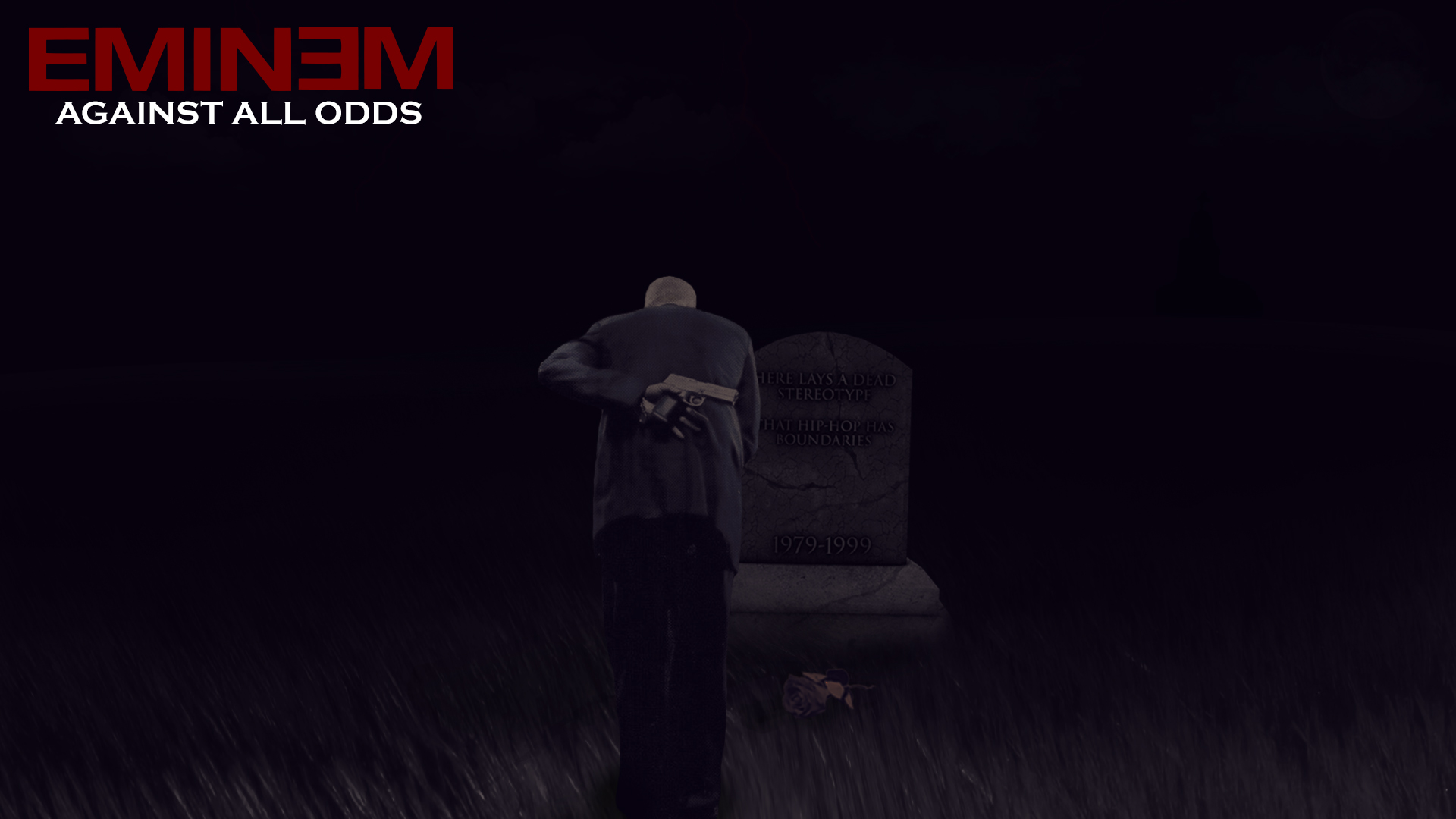
So basically I made this Eminem fan-art about him being the first true critically and commercially successful rapper(Yeah I know about Beastie Boys and Vanilla Ice). And when it came to putting some text in the image I got stuck on the typeface choice. I have used Copperplate Gothic here but I wanted to ask is it appropriate? This confusion was mostly due to someone saying in a thread " Copperplate is a great font but its used in a lot of wrong places". What do you guys think? Is this appropriate? It looks fine to me but I want your advice.
Thanks

…the first true critically and commercially successful rapper…

Melle Mel.

Copperplate Gothic: what has this to do with Eminem and hip hop?
It’s an old face that was used for small text on biz cards 100 years ago, and more recently at display size because it was bundled with a lot of apps, and people didn’t know any better.
The problem is that the teats on it are too big at display size, giving such typography a clumsy appearance.
So the experts will always consider its use in display as inappropriate.
But if your client likes the way it looks, feel free to ignore them!

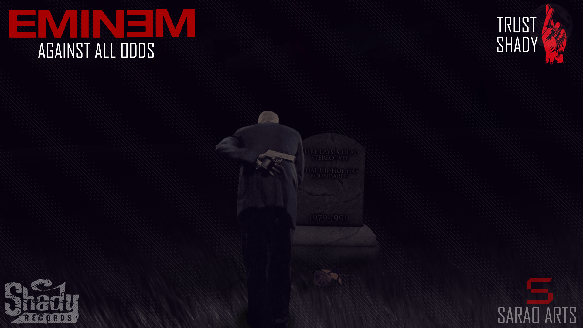
Hey thanks for the help. This was just a personal project but I want to learn about Typography and Design, so I thought I should just ask about it. I changed the typeface to Agency FB, for the simple reason that it was the typeface that most resembled (There are subtle diffrences but it was the one that came the closest) the one they use at Shady Records(Eminem's Record Label) website. Thanks.

Captured from web.archive.org on 14 Jul 2014. view this capture