Over the last year or so I've grown quite interested in (roughly) nineteenth-century face styles around the Bell, Oxford/Monticello and Scotch Roman evolutionary tree. For a while now I've been working on designing a typeface based on some of the ideas I've had along these lines.
W.A. Dwiggins famously set out to tame Scotch Roman by blending it with modern features from William Martin's work, resulting in Caledonia. I wanted to try moving in arguably the opposite direction: exploring the possibilities found in Scotch's immediate precedents among the transitional types.
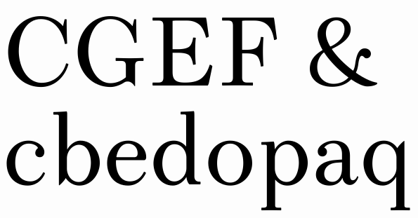
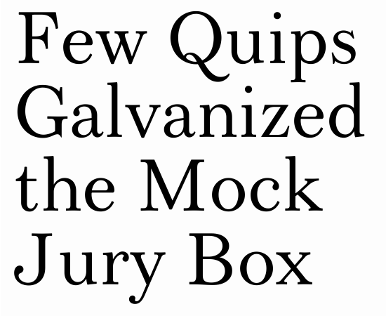
This is what I've come up with. I took some basic ideas from Scotch and Bell and tried to create something with a crisp and rational structure but a touch of nineteenth-century ornamentation.
I haven't settled on a final name for it yet. For the time being I've dubbed it 'Alexandrina' because it strikes me as vaguely Victorian. (A nod to any who get the reference.)
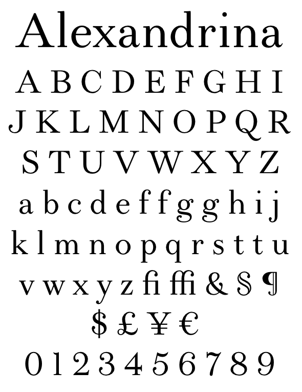
I'm basically aiming for something that's good for captions and relatively short snippets of text, but could be used more generally without causing serious problems. I think it probably works best at around 12-15 point.
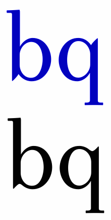
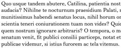
I have alternate versions of /f, /g, and /t which I'm thinking should be made default at 12 point size and below. (The last paragraph in the PDF shows the use of these alternates in a 12-point paragraph.)
I'm still not sure about a few points...
- I'm not sure if the ampersand works. It looked nice when I sketched it on paper, but after creating the outline I'm not so convinced.
- I'm not happy about the @ sign... not only is it pretty generic but I don't think it's all that well drawn. (This is by far the hardest character for me to draw, as a rule.)
- The numbers need a bit more work still.
- I think some of the symbols are probably a bit too light.
Any thoughts?
Thanks...
| Attachment | Size |
|---|---|
| alexandrina130620.pdf | 31.29 KB |