Typophile

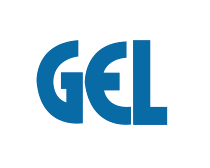
suggestions on accompanying type with this logo

Etah Chen

hi.
any quick suggestions or starting point for a type that that can accompany this logo?
it needs to read at small sizes and have some of the same dna. i've gathered a lot of stuff i thought would fit,
but i'd like to see if i'm on the right track compared to other typophiles. thanks.
-etah chen.
(deleted)what i have so far

second round
(deleted)

(deleted)

Hi!
I will try some lower case, to make a clear difference,
Maybe avant garde lower case would be a good choice :)
In my opinion of course!

Offhand, I don’t know of any circle-based fonts that have that kind of “uncial” /E.
If it’s just the word EQUIPPED you need, as part of the logotype, why don’t you make it in Illustrator, to match the GEL letter style? That would take less time than trying out lots of fonts that obviously don’t match. It’s not as if there are any tricky letters like /S to draw.

I will second Nick's suggestion of drawing it yourself. I would also take care to rebalance the current "GEL" letterforms. They appear to be the result of some horizontal condensation so either thicken the verticals or lighten the horizontals. As it stand now it looks amateurish.

Captured from web.archive.org on 19 Apr 2015. view this capture