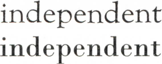
At the link below is a study of the effects of intraword and interword spacing that uses eye-tracking techniques used to study eye-movements in reading and presents the eye-tracking measures as providing a “metrics of readability.” This is somewhat of a departure, since most studies using eye-tracking techniques use the eye-tracking measures to draw conclusions about processing mechanisms. And recently the authors, Timothy J Slattery and Keith Rayner, did a study on the influence of text legibility on eye movements during reading (specifically in relation to ClearType technology).
The shift in eye-movement studies to talking about readability is noteworthy in relation to the association, in typography and type design circles, of readability with “the ease with which the eye can absorb the message and move along the line” [J. Ben Lieberman, 1967].
According to the authors, their results indicate that the optimality of intra- and interword spacing is font specific; font designers are doing a relatively good job at selecting default intraword spacing values; an optimal amount of interword space will be a balancing act similar to finding an optimal amount of intraword space; and there is an interword versus intraword offsetting effect relating perhaps to the countervailing demands of parafoveal and foveal previewing / viewing, and the benefits to foveal processing of an effective parafoveal preview.
The authors also suspect that, [paraphrasing here] for the purpose of reading, words are more important objects than letters: words are the important processing unit for reading. They argue that [paraphrasing again] it is the properties of words and their recognition that influence eye movements during reading. “While successful letter perception is a necessary step in reading, the bottleneck in reading performance is with word recognition.” Associated with this there is a recognition that disruption of “the integrity of word units” is an issue with increasing intraletter spacing.
How would using eye-tracking measurements to provide a “metrics of readability” work? Probably more needs to be done to formalize this, but in their analysis Slattery and Rayner look at “global measures” and “target-word-dependant measures” to form a global picture of effects, that looks beyond significance scores to trends. Typophiles interested in pursuing this can buy or use their institutional access, if they have one to explore this by going to:
http://link.springer.com/content/pdf/10.3758/s13414-013-0463-8.pdf
“Effects of intraword and interword spacing on eye movements during reading: Exploring the optimal use of space in a line of text” Timothy J. Slattery, Keith Rayner. Attention, Perception, & Psychophysics, May 2013
Abstract
Two eye movement experiments investigated intraword spacing (the space between letters within words) and interword spacing (the space between words) to explore the influence these variables have on eye movement control during reading. Both variables are important factors in determining the optimal use of space in a line of text, and fonts differ widely in how they employ these spaces. Prior research suggests that the proximity of flanking letters influences the identification of a central letter via lateral inhibition or crowding. If so, decrements in intraword spacing may produce inhibition in word processing. Still other research suggests that increases in intraword spacing can disrupt the integrity of word units. In English, interword spacing has a large influence on word segmentation and is important for saccade target selection. The results indicate an interplay between intra- and interword spacing that influences a font’s readability. Additionally, these studies highlight the importance of word segmentation processes and have implications for the nature of lexical processing (serial vs. parallel).