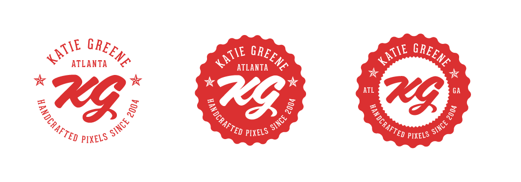
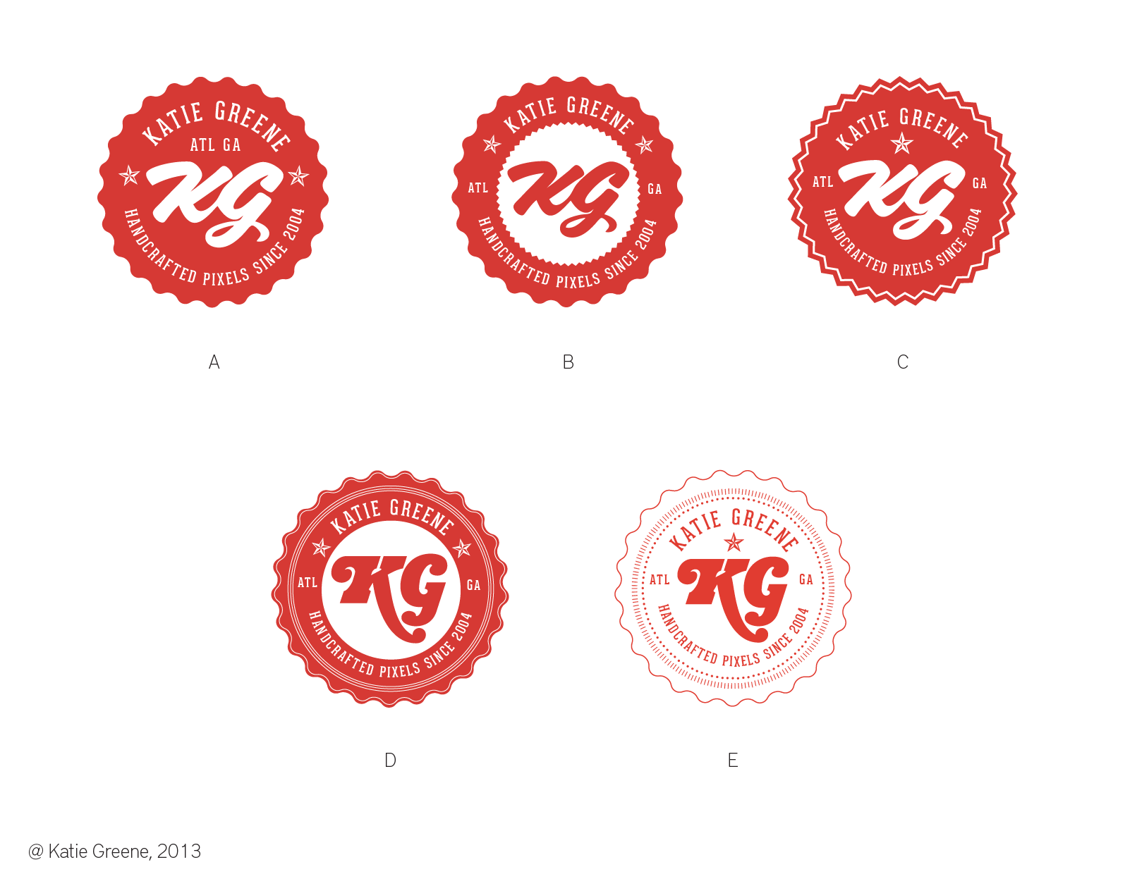
I'm working on my personal branding and would like some input on the logo that I've been developing. I've gone through about 50 variations of this, but am attaching the top 5 designs that were narrowed down based on a first round of critique from a colleague. The concept is based on a strong personal affinity for modern vintage design through the vintage seal/stamp shape and original craftsmanship. This is just the basic flat logo that I'll eventually add some slight additional styling and perhaps get turned into a physical rubber stamp for promotional print items.
I am seeking preferences for integrating the script typeface monogram which gives it the more modern edge versus the more slab typeface.
Thank you!
| Attachment | Size |
|---|---|
| final-five.png | 221.4 KB |