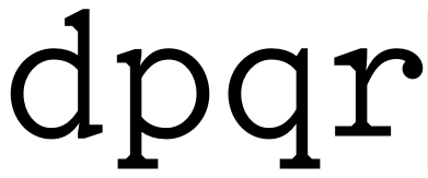
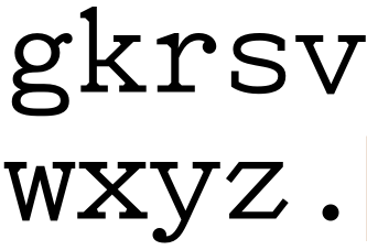
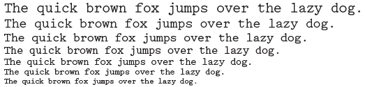
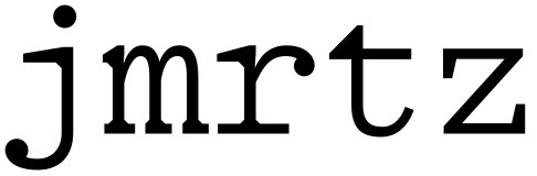
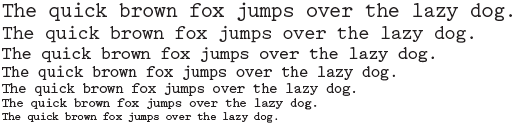
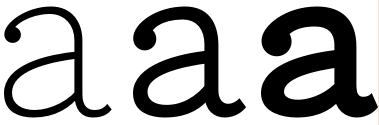
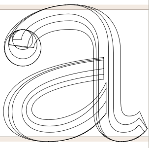
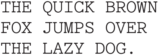
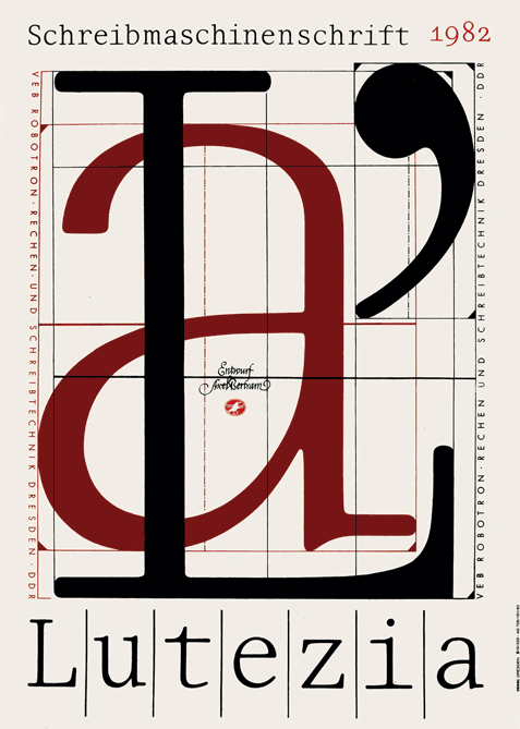
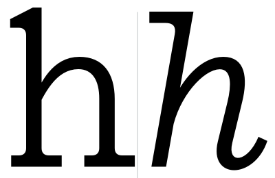
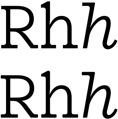
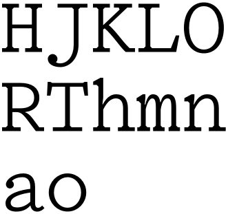
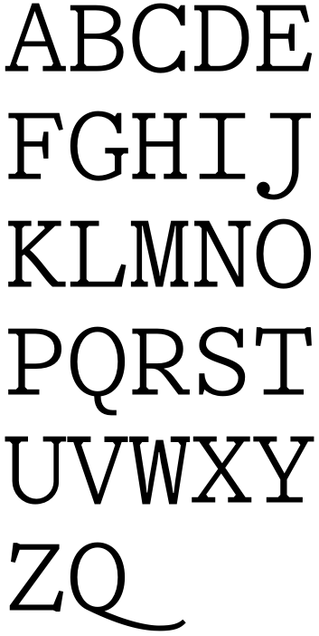
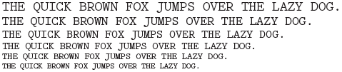
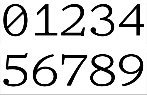
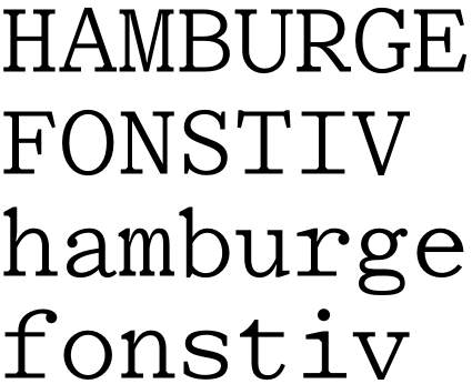
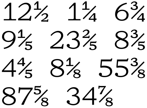
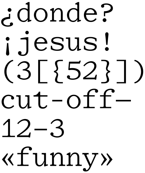
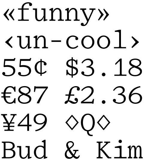
No clue if this is absolute rubbish or not. I found an old Caslon specimen and thought about doing a monospace version of it. It seems like most monospace fonts out there are very boring, so I wanted to do one that has a much more pleasant feel. Did some sketches and I've digitized a few letters so far. I think Kris Sowersby's Pitch has inspired me, you can see some of it in the bracketing.
Thoughts?
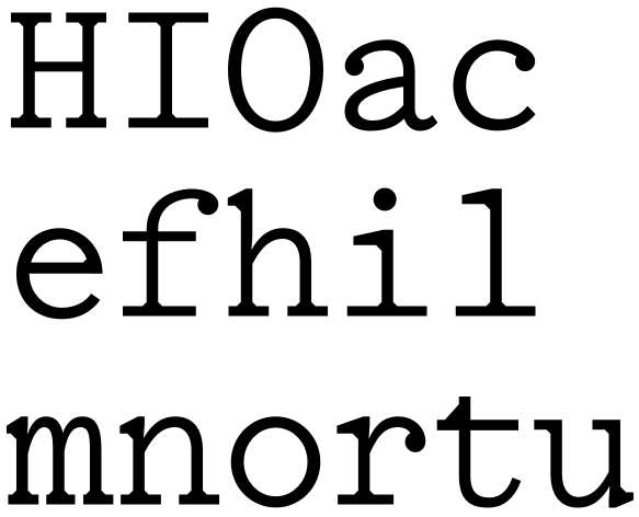
I wanted it to be very legible on-screen so it has a really tall x-height.
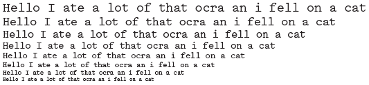
Some characters are pretty tricky. Anyone think this has potential or just isn't worth it?