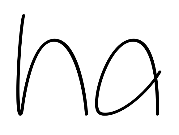
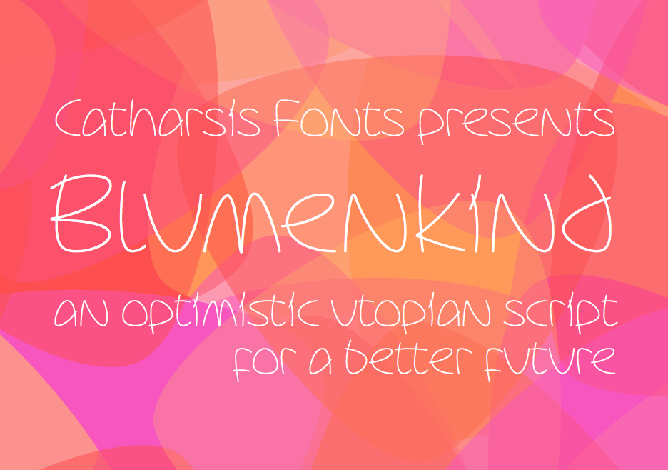
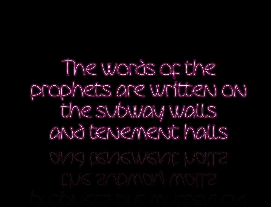
So I made good on my threat in this thread to build a font on the basis of some nice lettering from the 60ies I found on a residential building in Berlin... I've got a pretty complete set of paths now, whose look in the Glyphs editor I rather like.
Problem is, I need to stroke those paths to make a usable font. I'm not happy with the path expansion tool in Glyphs (it doesn't support rounded end caps and does unsightly things to sharp turns), so I've tried exporting an OTF from Glyphs to FontForge and doing it there. The workflow is pretty atrocious, crash-ridden (on the side of FontForge) and doesn't work well for very thin weights, so I'm very much hoping to find a better solution.
Does anyone know of a really good path stroking tool? Preferably free to use, though if you have a paid license, I might be interested to hire your services for a free license of the final font...
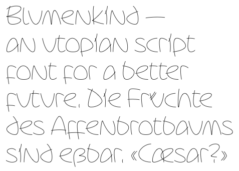
Here's what it looks like when I stroke the font at 25/20 units with a 40° angle in FontForge. Not too bad, though as I said things break down at very light weights.