Hello,
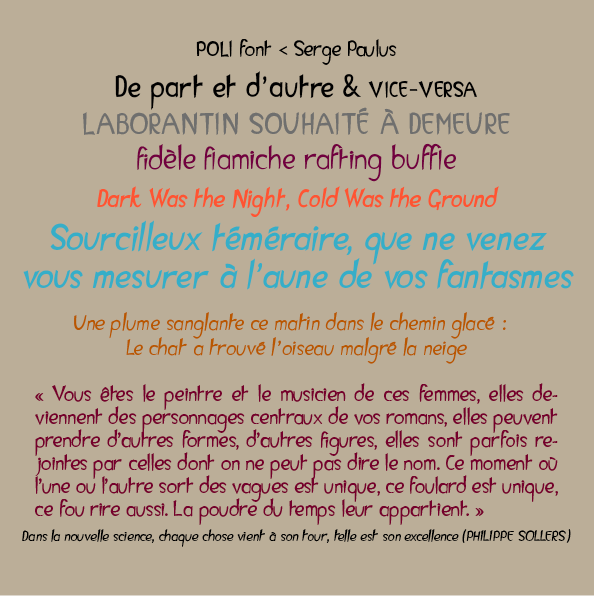
Poli is my second font, it's a 4 font complete sans serif family. It's a display typeface I guess. I wanted something elegant and crisp, something masculine and feminine at the same time. Poli inverses with some letters (c o d l p…) the classical thickness of the font (downstrokes are commonly down, upstrokes are up).
As I'd like to release it - so that I can begin another project - I'd like to ask here some critical advice...
Thank you,
Serge
http://www.serge-paulus.be/docs/poli.html
| Attachment | Size |
|---|---|
| test_page_Poli2.png | 46.28 KB |