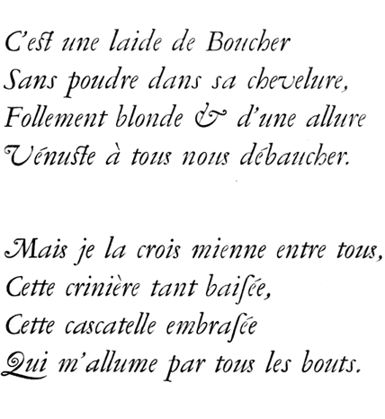
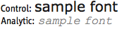
Has anyone at Typophile ever designed something to be harder to read on purpose--to make sure the reader slows down, and thus better understands the text? In particular, has anyone ever done this with a textbook or other educational materials? Or has anyone made another design decision with a similar effect, such as printing the text in light gray?
Note: there is some empirical research suggesting that using more difficult typefaces can increase comprehension. Dan Kahneman discusses some of it in Thinking Fast, Thinking Slow, and a very recent example is the new study described here, which finds increased gains for dyslexic readers:
http://www.telegraph.co.uk/education/educationnews/10089102/Hard-to-read...